What makes a Great Charity Website?
During the first few months of the year we often find ourselves advising charities on refinements or redevelopments to their websites. Many of the considerations for a charity site are exactly the same as for any other website. Focus on the purpose of your site and the people using it. This will keep you on the right lines. The best sites are all about the user. They’re considerate of overloading users with choices or too much text. They make calls to action obvious and ensure that users can easily find further information as needed.
What Elements does a Great Charity Website have?
As website users, we are becoming increasingly impatient. Just like any other sector, third sector websites need to deliver a clear and engaging case for support in an instant. Failure to achieve this is a risk to the charity. The risk of losing potential donors / supporters / members on arrival to the site is not a risk many can afford to take. The best charity websites have several things in common. You may not be ready or able to redevelop your charity’s website right now. The ideas and suggestions here are our tips for charities to help you improve what you’ve got.
Clarity on purpose and focus on the user
Many of the charities we work with know how to talk about themselves, their purpose, their achievements, and their impact. They’re often less aware that their website isn’t about them, it’s about the people using it. Encouraging a membership organisation to focus attention on its members is not revolutionary. Neither is suggesting a charity focus on its supporters. Charities like yours are doing it every day. It’s our job to show you how to translate that focus into your website and digital communications.
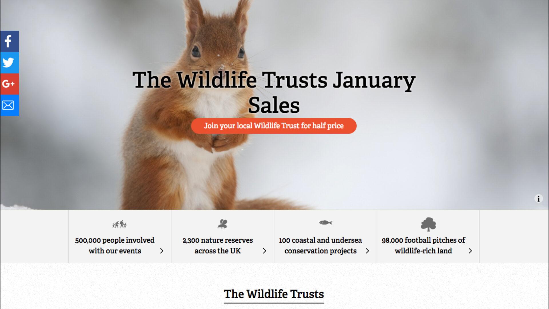
The Wildlife Trusts use their logo, photographic imagery, and copy to clearly state their purpose. Their use of colour in the calls to action make it easy for the user to engage on the site.
Simple navigation and digestible content
Have you noticed how streamlined the very best charity websites appear to be? They haven’t always sacrificed thousands of words of copy. Instead they’ve trimmed the fat. They’ve undertaken exercises in information architecture to simplify the user journeys. They’ve broken the written content down so that the user can choose what to read and when. Your copy will need rethinking as a result of simplifying your navigation and considering your content hierarchy. This is a great time to encourage your charity to stop writing what they want to say. To change direction and start asking what users want to know.
RNLI have broken this article down into bitesize chunks so that the user can consume at their own pace.
Excellent use of video, photography, infographics, and other visual content
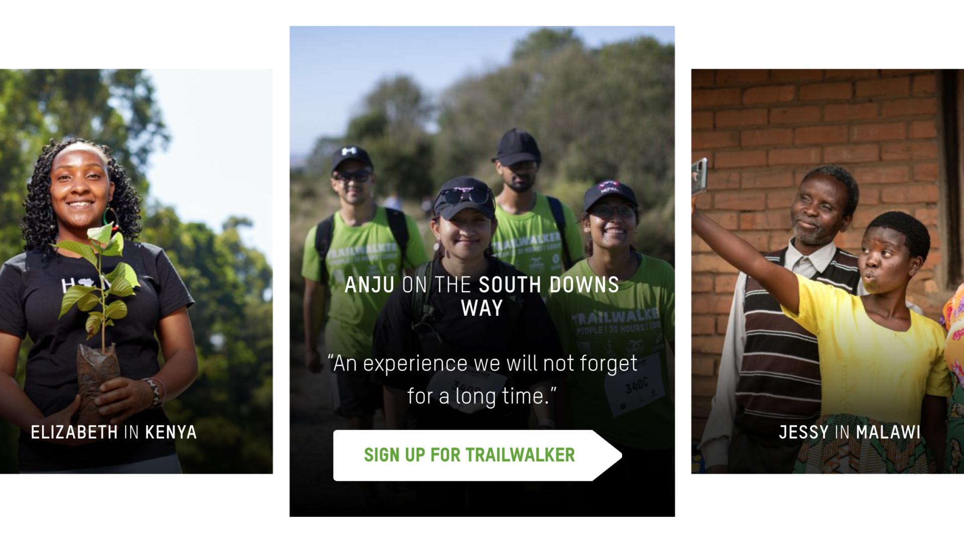
Strong use of visual content creates impact and demonstrates what the charity is all about. A youth charity must be clear that they’re working with young people. Similarly, if your organisation focuses on wildlife, your visual content needs to reflect that. Video content in banners, explainer videos within the copy, and graphics / infographics are all cues. These cues help your user to build a picture of what they’re getting involved with when they sign up.
Oxfam use their photography and colours on call-to-actions as great cues for users to build a picture on what they can expect when signing up for their fundraisers.
Clear Calls to Action
Making a donation is rarely the only useful action a web user can take on a charity’s site. It’s important to define all actions that a website user could take that also have value to the charity. Register Now, Learn More about Volunteering, Join our Team, Apply Here, are all valid calls to action. They show the user how to complete the experience that they arrived onsite to achieve. Eg a user has arrived on your site to find out more about an event. It must be abundantly clear to them how to sign up for that event.
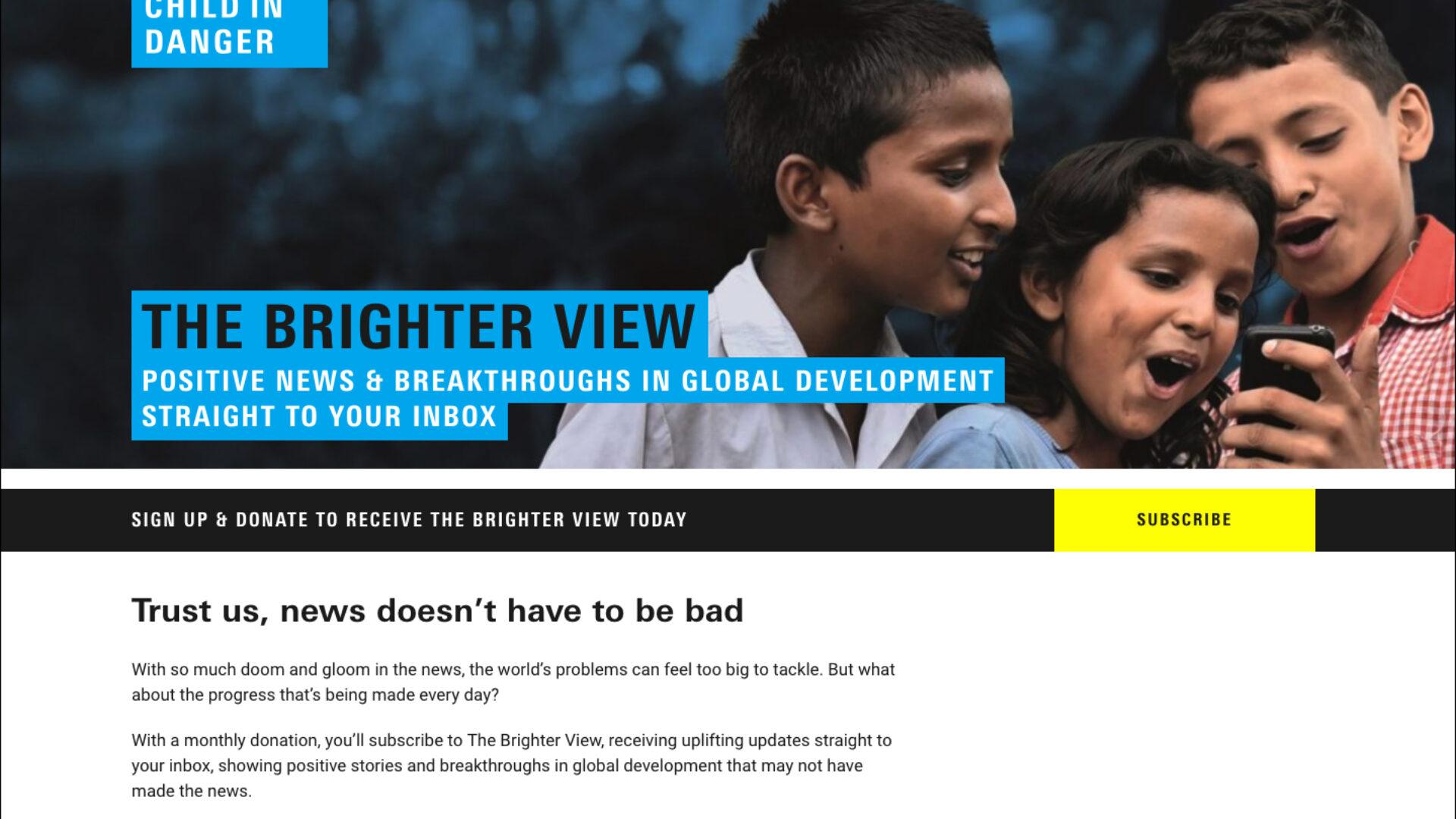
Unicef’s Brighter View landing page is directed to through social and display retargeting ads. The calls to action are clear and simple, leading to a short subscription process.
A fantastic mobile experience
Many charities are still experiencing high volumes of desktop users. They’re also seeing a rise in mobile visitors to their sites. Overall the third sector is behind in catering to the rise in mobile usage. We’re spending an average of 24 hours a week online via smartphones. This is expected to continue to increase. Delivering a seamless mobile experience for your website users is now more important than ever, especially if you have a young audience.
Childline have multiple journeys mapped out, and services available on their site. These all function well on mobile devices, perfect for their audience’s needs.
A clear and simple donation process
Income generation is a core purpose of many charity websites but fundraising is something to be handled gently. Be aware that not every user on your site has come with the intention to give you money. A new person on your website needs you to convince them first by taking them on a journey through your site. All the best fundraisers will tell you that their success is build on great relationships. Specific landing pages are great for this. Users are taken to a campaign page when they’re already in a relationship with you elsewhere. Maybe you’ve been having an email relationship. Perhaps they’ve been engaging with you on Twitter or LinkedIn. Once someone has made the decision to support you, they want the process to be clear, simple, and quick. Many charities ask for countless fields of personal information before you can make a donation. Users want the option to pay and go. They don’t always want to give you their inside leg measurement before they part with their £30. Make it easy for those users. Don’t forget the post-donation actions. Thank them, and invite them to keep in touch with you.
Charity Water ask for the bare minimum in personal information before the user can make a donation. This makes giving a fast and painless exercise for the donor.
Need help?
We understand the challenges you face as a charity. We can help you reach your target audiences, increase conversion rates, convey your core messages, and improve user experience. We’ve designed and developed websites with charities, membership organisations, and not-for-profit organisations. These include: CIWEM, Duchenne UK, National Deaf Children’s Society, Ellen MacArthur Cancer Trust and Kit Us Out.