The challenge
We were tasked with creating an accessible, adaptable and consistent brand that would be representative of the charity’s diverse audience. We also needed to explore ways to introduce illustration as an alternative to stock imagery, mirroring the charity’s unique approach to its work.
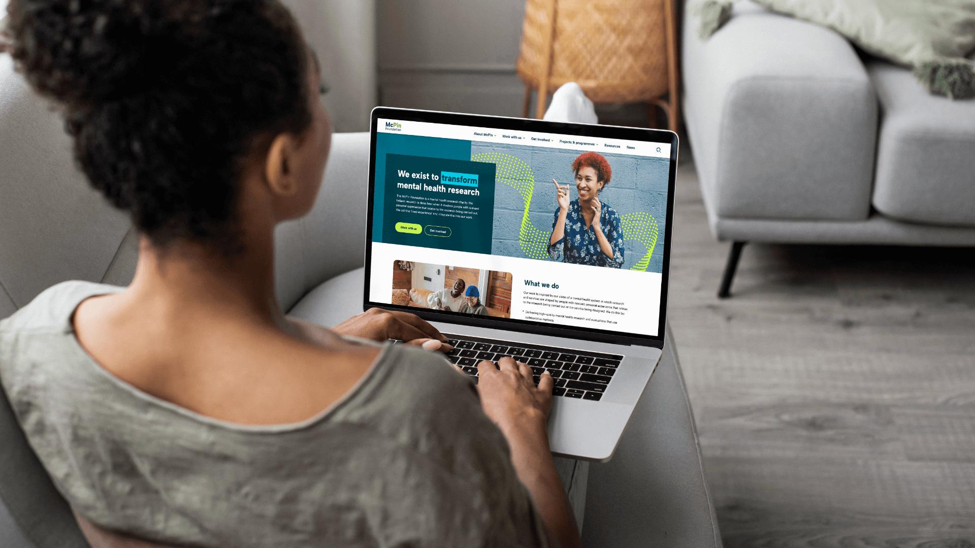
As well as the brand, the McPin Foundation’s website needed some attention to improve its user experience and create more fluid navigation.
The solution
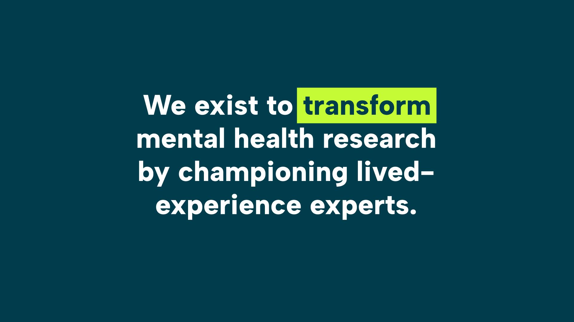
Through our scoping workshop and immersion, we identified several elements that could be refined and amplified to centre the brand. We redesigned the charity’s logo and created a broader and more accessible colour palette. A more expressive and freely available typeface was introduced, giving structure and establishing consistency.
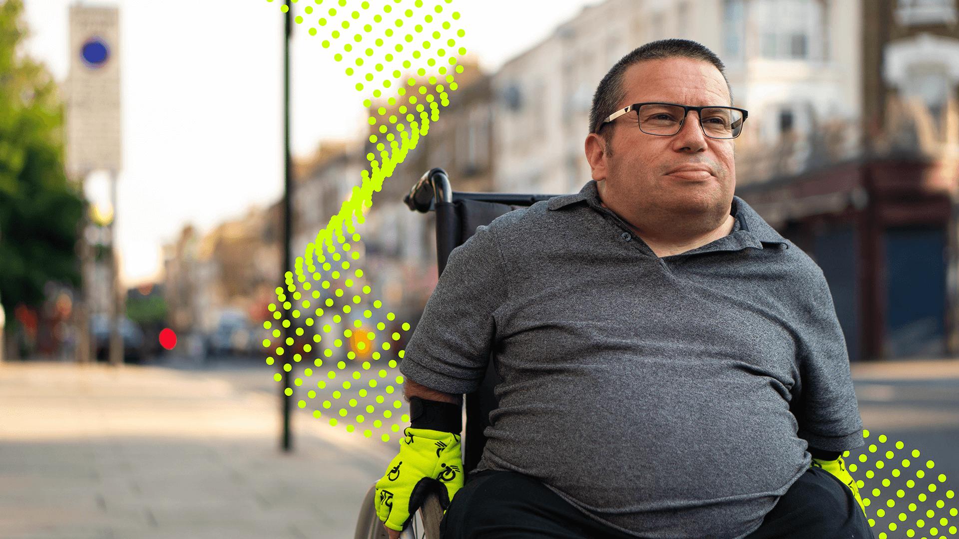
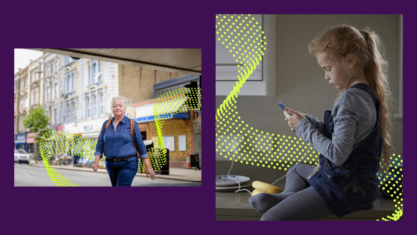
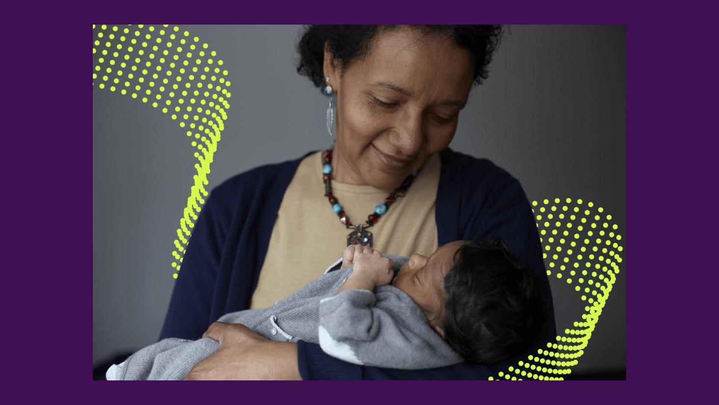
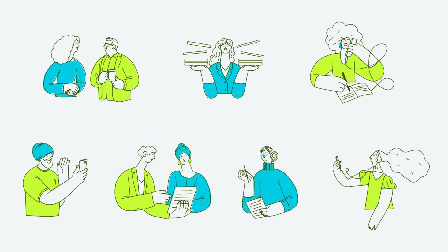
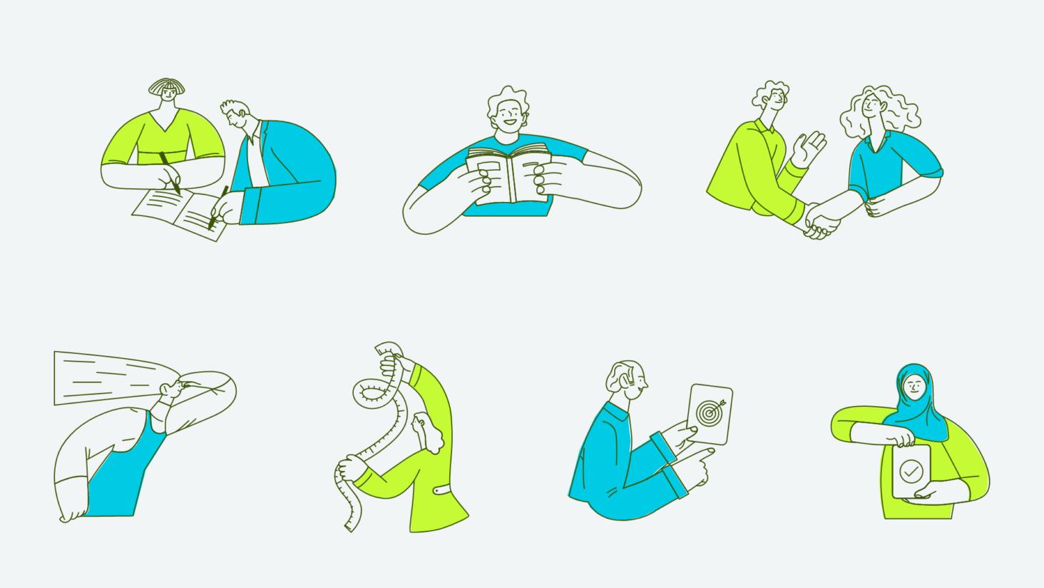
Next, we looked at how we could build illustrative features into the brand, reinforcing consistency and brand recognition. Referencing the green ribbon – the symbol for mental health awareness – we created an abstract ‘digital ribbon’ that could then be weaved into the McPin Foundation’s existing imagery. The ribbon could be strategically placed into the scene of an image and interact with its subjects, echoing the charity’s focus on the individual. For an added contemporary feel, a vibrant set of characterful illustrations were also introduced to further elevate the brand.

Transforming the user experience
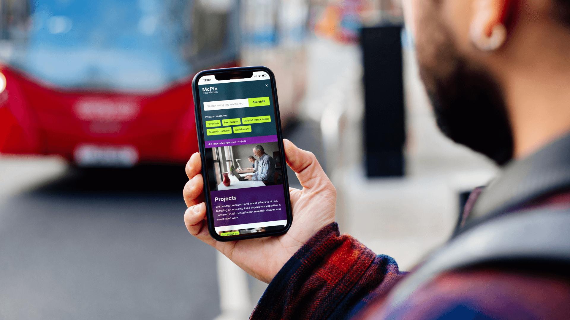
After gaining some great insights from our UX discovery workshop, we could then start tackling the website and create ways to streamline the user experience. With the current charity website structure feeling very “clunky” and extremely difficult to navigate, we set out on organising the wealth of online resources into relevant projects.
This approach was guided by personas defined in the workshop. Understanding this meant we could get to know the needs of each of these audience groups and map out key content areas and logical steps they would take to find relevant information.
We designed a new resource library with a simple and clean layout, searchable by topic and resource type filters, making it easier for users to browse and search for what they need. We also included a much-needed search bar, allowing users to quickly and easily find resources by keyword.
With the brand applied to the now fully functional website, we were able to help the McPin Foundation find a look, feel and experience that truly matches their progressive work.