Inside Our UX Discovery Workshop for Charities

Introduction
Every successful digital project starts with understanding people, your supporters, service users, and the team behind your cause. One of the best ways to build that understanding is through a UX discovery workshop.
These sessions help us uncover what really matters to your audiences, where your website might be falling short, and how design can help you meet your goals more effectively.
As the UX Lead, I guide you through the workshop to uncover valuable insights that shape an accessible, inclusive and impactful online experience. We start with empathy, listening carefully, asking the right questions, and making sure we fully understand your users’ needs, your organisation’s goals, and the challenges you face.
In this guide, I’ll share what happens during our UX discovery workshop, what to expect, and how you can get the most from the session. Whether you’re about to start a new web design project with us or simply want to understand our approach to UX design for charities, this will give you a clear picture of how we work together to create digital experiences that make a difference.
What User Experience Design Means for Charities
User experience (UX) design is about how people feel when they interact with your website or digital tools. For charities, this means designing digital spaces that make it easy for people to learn, connect, and take action, whether that’s donating, accessing support, or getting involved in your mission.
Good UX design isn’t just about making things look nice. It’s about empathy, accessibility and purpose. By understanding your audiences and what they need, we can design solutions that remove barriers, build trust, and help you achieve greater impact.
Using Miro to Collaborate
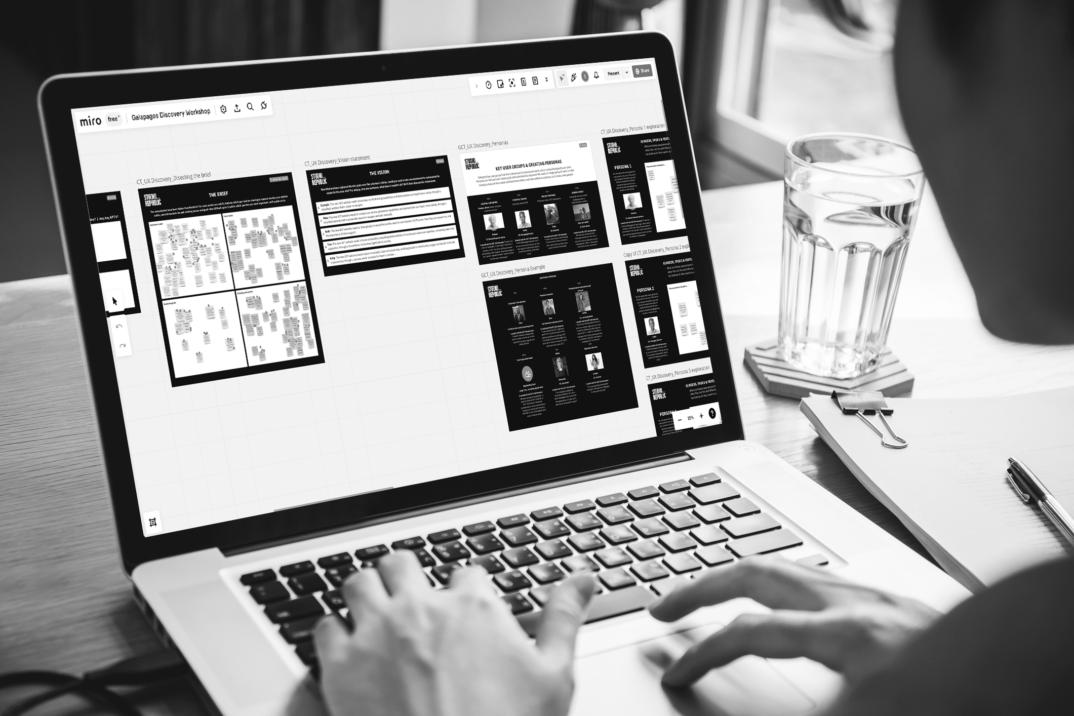
We use an online whiteboard called Miro to run our workshops. It’s an accessible, collaborative tool that allows everyone to contribute, whether you’re in the office or working remotely.
Before diving into the workshop, we like to help you get up to speed with everything you need first. This includes signing up for a free Miro account. You may already be familiar with the online tool, but if you aren’t, it is an excellent platform that helps teams to easily collaborate remotely and provides the perfect functionality for our workshop.
On the day of the workshop, we’ll run a short ice-breaker activity that doubles up as a tutorial for Miro so you feel comfortable and confident before getting started. Even though we’ll take you through the basics, we still always recommend having a quick practice yourself before the workshop to do the following:
- Create a new blank board once you have set up an account.
- On your blank board select (N) on the keyboard to create a sticky note, choose a colour and then click anywhere on the board to add it to the page.
- Double click on a sticky note to begin typing inside it.
- To duplicate a note or object you can either use: Ctrl + D (Windows) Cmd + D (Mac), hold Alt + drag (Windows) Option + drag (Mac) or simply copy and paste.
- Zoom in Ctrl + + (Windows) Cmd + + (Mac) Zoom out Ctrl + – (Windows) Cmd + – (Mac)
- Move around the canvas by using your trackpad or mouse or hold space bar + drag
If you master these then you’ll be all set when we send out the link to our board for the workshop!
What we’ll cover
The workshop is split into four parts:
- Recap the brief and identify the project requirements
- Key user group insight through creating personas
- Reviewing content and page structure
- Additional questions and summary
1) Recap the brief and identify the project requirements
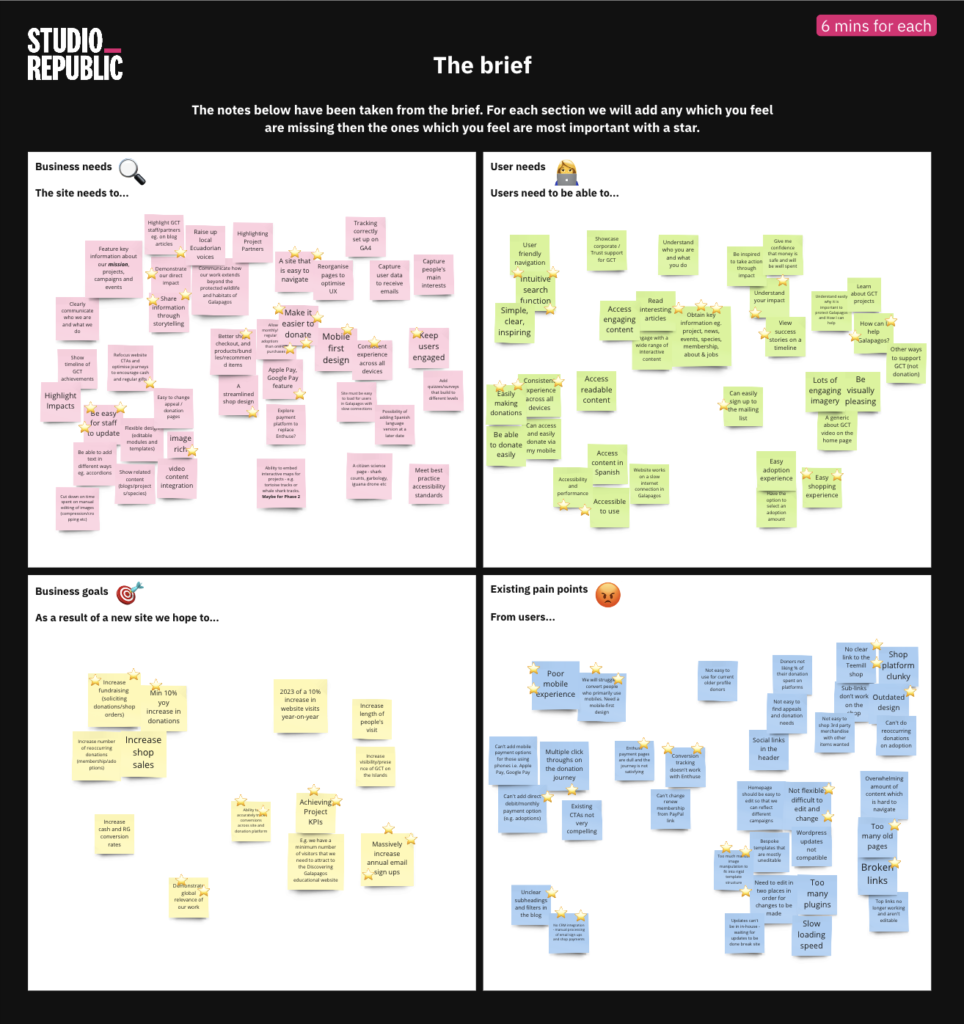
We start by revisiting your brief to make sure we have a shared understanding of your goals, challenges, and measures of success. This part helps us uncover what your website really needs to do, for both your team and your audiences.
We explore:
-
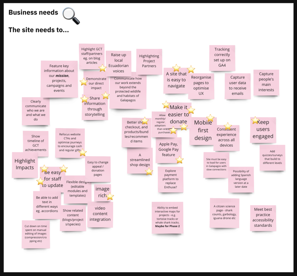
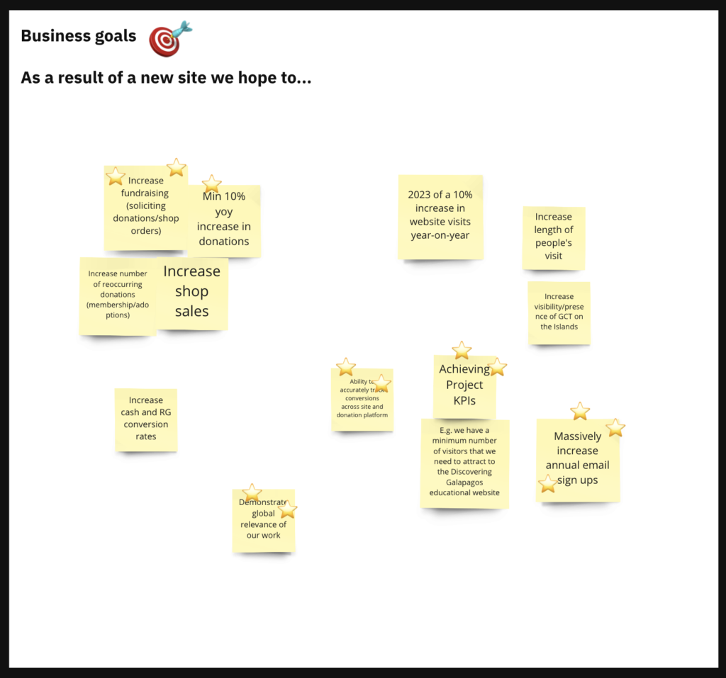
Organisational needs: What must the new site achieve for your charity? For example, simplifying content management, improving storytelling, or supporting fundraising goals.
-
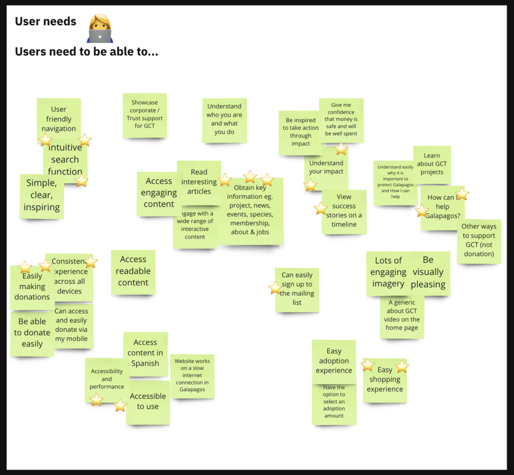
User needs: What do your audiences need to do? For instance, finding information quickly, accessing services, or making donations easily.
-
Goals and outcomes: What change do you want to see? More volunteers, higher engagement, or stronger supporter retention?
-
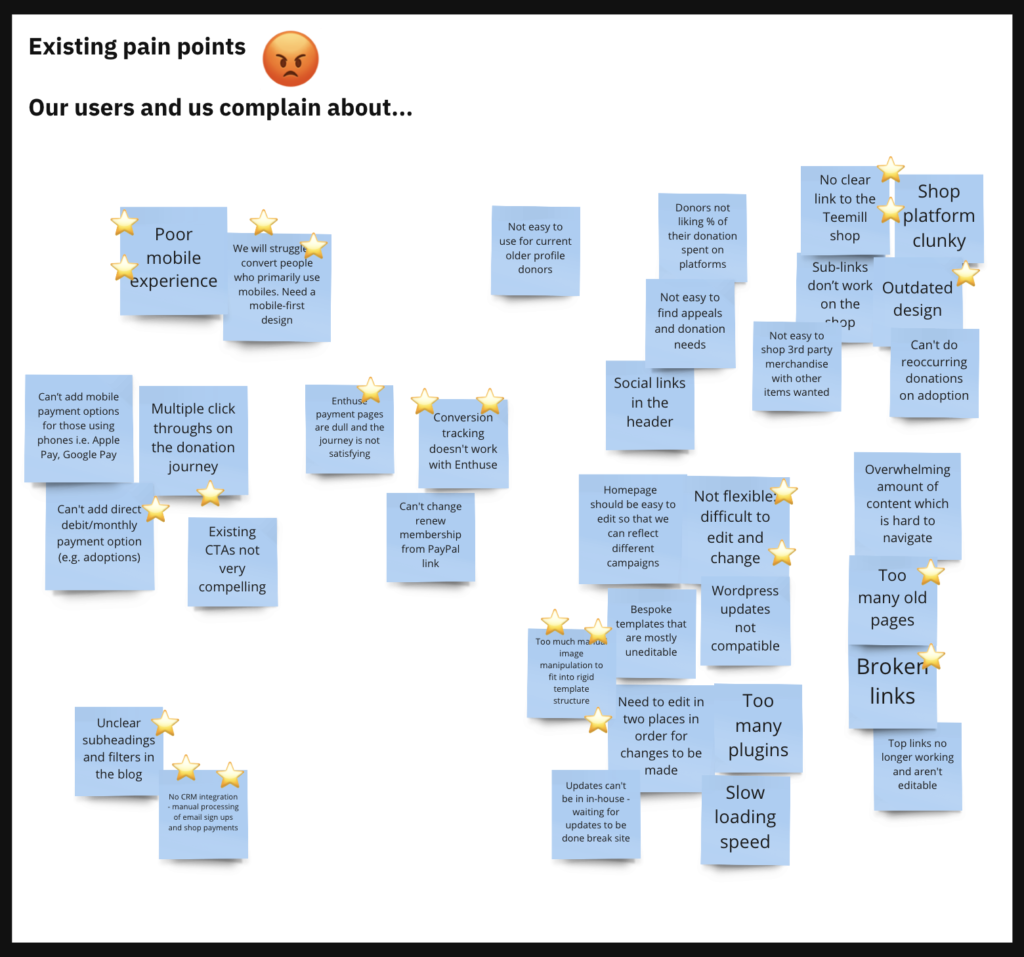
Current challenges: What frustrates users or your internal teams? Perhaps the donation journey feels clunky, navigation is confusing, or outdated content is hard to manage.
We capture all of this visually in Miro, using colour-coded sticky notes to make patterns and priorities clear. Together, we identify what’s most important so we can focus on what will make the biggest difference.
We’ll spend time exploring each of the four sections one at a time before moving on.
The four areas are:
Organisational needs:
What does the new site need to do from your perspective? For example: be easy to navigate, share information through storytelling, or be flexible to add text in different ways.
User needs:
What do users need from the site? For example: be able to donate easily or to understand who you are and what you do.
Goals and outcomes:
Focussing more on those actual targets and measurable key performance indicators (KPIs) that you hope to hit as a result of the new site, such as the number of email sign ups or donation percentage increases.
Current challenges:
Those issues that your users complain about which negatively impact the overall user experience, as well as all the things that frustrate you about the site internally! Examples of these could be: too many click throughs in the donation journey, complex navigation structures, or too many old pages present.
It takes a bit of time to go through all four sections, but this ensures that we leave no stone unturned and feel confident that we have a thorough understanding of what we need to do get the project off the ground and working in the way you and your users want.
2) Key user group insight through creating personas
So, how well do you know your audience? We’re about to find out!
In this exercise we further explore your key user groups outlined in your brief and create personas to help us empathise with them. Personas are semi-fictional characters whose goals and characteristics represent the needs of a larger group of users. For a persona to be really effective, they need to be based on real data collected via surveys, interviews or data analysis, so we know we’re empathising with the right people! We can then use this information to step into their shoes and map out their needs, motivations, frustrations, and goals. This will be used to guide all of our UX actions through the project so, the better we know our audience, the better the solutions will be.
There are three types of methods available to create personas and each provide different levels of reliability and in turn require different amounts of time (and budget) to define.
- Proto personas – based on educated guesses from your team’s knowledge of your audience without carrying out any specific dedicated research to validate your assumptions. These are a very quick, easy and cheap way to gain insight into your assumptions about your audience. However, as they aren’t built on any reliable data, they are subject to bias and limits the accuracy and reliability they provide.
- Qualitative – based on interviews and focus groups to understand your users. This is an excellent way to collect detailed insight into your users needs and goals. The only main downside is, they take a lot of time to carry out making it a pricey process. However, the insight you can gain is invaluable, making it totally worth it.
- Statistical/quantitative – based on larger scale sample methods from the collection of a lot of data such as surveys, user testing, or Google Analytics data to understand your users and their behaviours. This method can be fairly cost effective and quick to do, helping to provide you with key themes. For an even more reliable set of personas, this method can be combined with the qualitative method above!
No matter which method best fits into your budget and capacity, we can create a set of viable personas in order to develop an experience that is intuitive, positive and dynamic for your users.
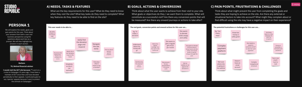
We also take time to uncover opportunities for user research and testing. The most effective approach to UX design starts with understanding the real problems users face, validating those insights and defining what needs to change, before any design work begins. Depending on what the project needs and what the budget allows, that might mean running user interviews or surveys early on, using card sorting or tree testing to shape the information architecture, or setting up usability tests once designs are live. We work with you to understand where the gaps are in your knowledge, what assumptions need testing and where your audience feedback will provide the greatest value to the development of the project. From there, we shape a research plan that fits your project and keeps your users at the heart of every decision.
3) Reviewing content and page structure
One challenge we hear time and again at the start of a project is around navigation. Content has grown over time, becoming cluttered and hard to find. It no longer reflects what users actually need and even internal teams end up relying on Google to track things down. During the workshop, we start to unpick those issues. It’s the first step towards creating a clearer, more intuitive structure that works for your audiences and supports your goals.
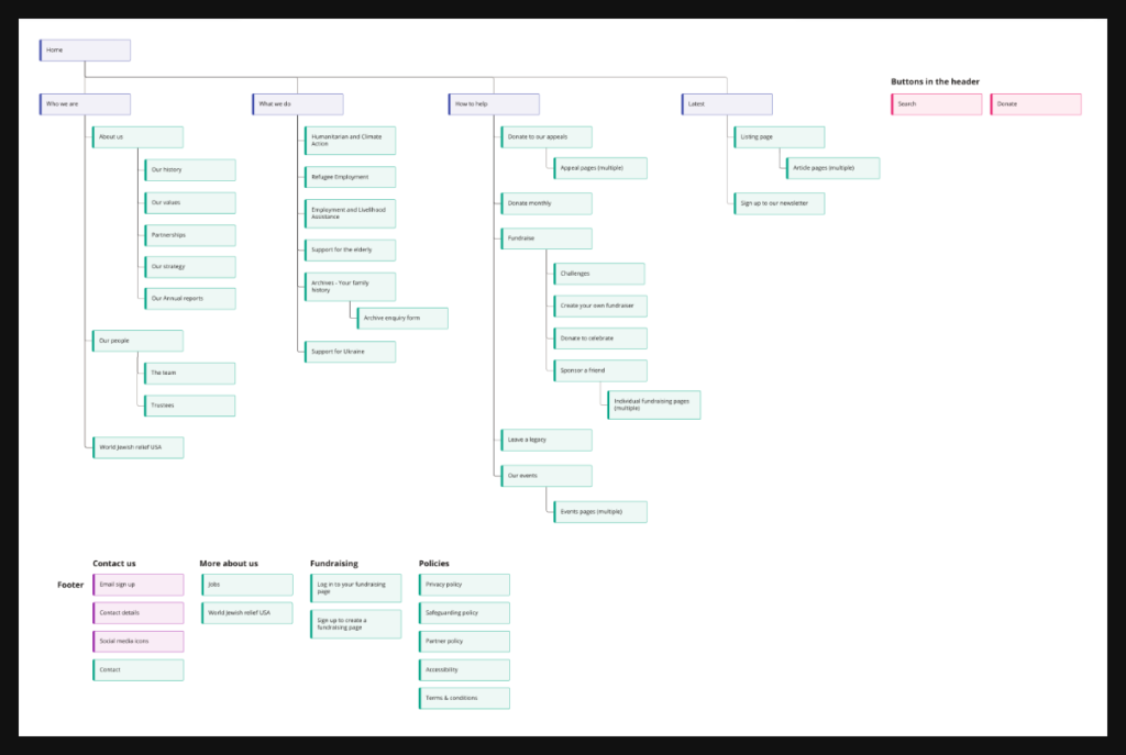
By this stage in the workshop, we’ll have a clearer picture of who your users are and what they need. That means we can begin thinking about how to shape the site navigation around them. One of the ways we do that is by working together on a draft sitemap.
The sitemap maps out the core structure of the site, highlighting navigation links, key pages, essential content and the all-important calls to action. This isn’t about locking in a final structure. It’s about surfacing how you currently understand and prioritise your content and getting a shared view of the site’s potential scope. What we capture here becomes a starting point for developing a refined information architecture, backed by user research and tested design thinking later in the project.
To do this we’ll map out the existing structure of your site with menu links in blue, sub-pages in green, content in yellow, and any key call to actions highlighted in pink.
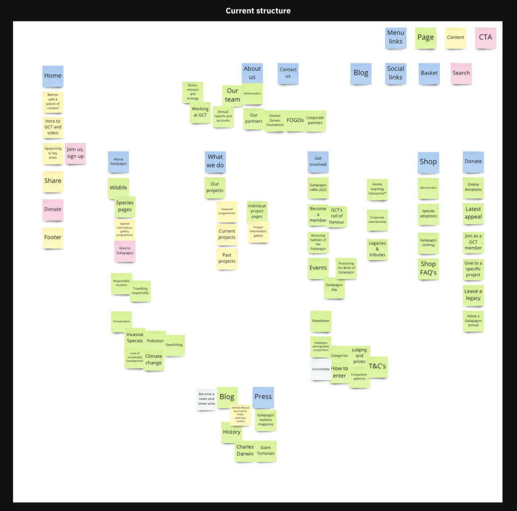
In this exercise we’ll start by deciding which pages and content need to go as well as identify any opportunities to anything new. This will then feed into the overall structure of the site so we can create a neatly-packaged final product that’s relevant, up to date, and easy to use.
For larger or more complex sites and where budget allows, we often follow this up with additional research. Card sorting, for example, invites real users to organise your content in ways that make sense to them. It’s a simple but powerful way to understand their mental models and make sure the navigation mirrors their expectations.
We also use tree testing to validate the structure. This involves giving users realistic tasks and observing how they navigate the updated navigation. Their feedback helps us spot friction points early and make targeted improvements. It’s another way we make sure the final structure works smoothly for the people who matter most, your users.
The questions show the kind of things we’ll ask you in the workshop to get you thinking about your content and page structure so it’s always a good idea to get your brain ticking with these prompts in advance to gather initial thoughts to come prepared with. If you’ve already had thoughts about your content structure or even conducted an audit, don’t forget to send this over before the workshop!
- How well is this structure serving your users?
- What do you think is wrong with it currently?
- What could be changed?
- What could be removed?
- Is there anything that needs to be added?
- Are areas categorised and correctly labelled in a way which makes logical sense to users?
- Does anything need to be given a higher priority?
- What specifically is it about your site structure that makes it difficult to navigate?
After some in-depth discussions we’ll have a good view of how you see your content, identify the issues and opportunities, and be able to define the problems and next steps which will form the foundation of our work on the sitemap.
4) Additional questions and summary
All of this valuable insight allows us to define the key challenges and objectives for the project that we need to solve throughout our UX design process. This information provides us with a measure of success in order to create a seamless user experience on your new site, that will most importantly work for users, lead to conversions, keep them coming back, and tell others about the positive experience they had using your site.
We’ll close the workshop with any questions that you may have for me and I will explain what the next steps will be in terms of UX deliverables including:
1. Create the sitemap – building on the work we have done in the workshop, conducting any additional user research and carrying out our internal UX processes in order to finalise the architecture of the site.
2. Create a set of modules that form the building blocks of your site to enable the functionality required, across mobile and desktop.
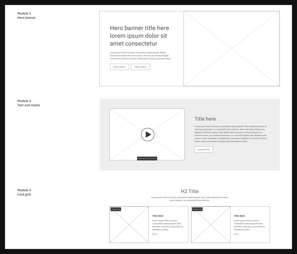
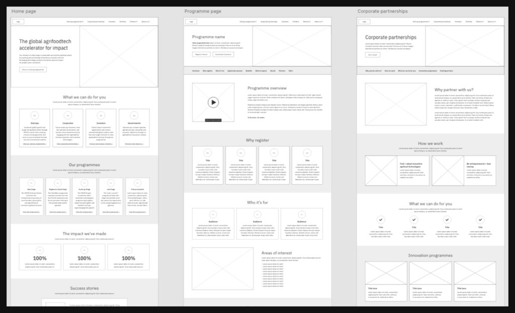
3. Design a wireframe using the modules – to create a clickable prototype which illustrates the layout and structure of the site and test how users will navigate around the site.
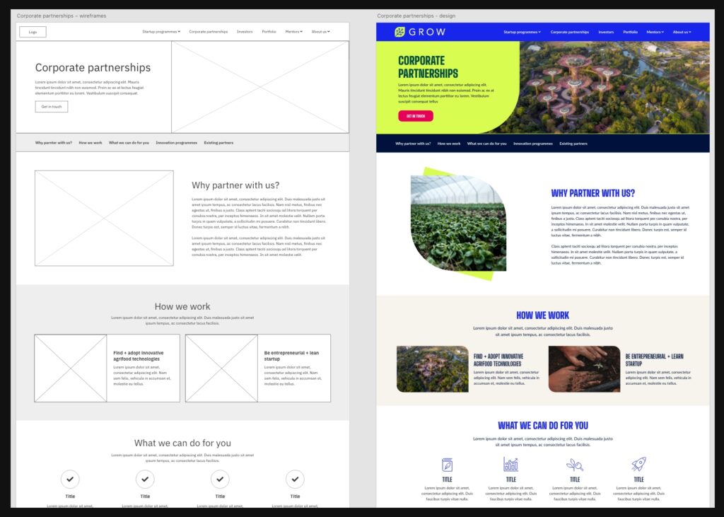
4. Once all of the above has been amended as a result of user testing and internal feedback, the framework for the site is signed off and handed over to our experts for visual design.
Final Thoughts
Our UX discovery workshop is all about uncovering the insight that helps your charity create meaningful digital experiences. It’s the foundation of a website that doesn’t just look good, but works hard, empowering your audiences, driving engagement and supporting your mission every step of the way.
If you’d like to learn more or join us for a UX workshop, get in touch with me directly at harley@studiorepublic.com. We’d love to help you create a website that truly serves your community.
Are you ready to amplify your UX?
Hi I’m Harley, UX Lead at Studio Republic. If you’d like to book in a free 30 minute call with me to discuss our UX Audit and your website please click on the button below. Or give me a call on 01962 659 123.
