The challenge
Children with Cancer UK has achieved extraordinary impact over 35 years, raising more than £300 million, investing almost £10 million into family accommodation near hospitals, and creating unforgettable experiences for over 75,000 children and families. Yet brand awareness did not reflect that scale of impact.
With a new CEO, Jo Elvin, appointed and a significant anniversary on the horizon, the organisation recognised a pivotal moment to redefine how it showed up. The ambition was not simply to refresh a logo, but to reposition the charity with clarity, confidence and emotional resonance, creating a brand that could stand out in a crowded and often visually similar charity landscape.
Working from the strategic foundations developed alongside Still Curious, we were tasked with translating a clearly defined strategic direction into a bold, future-facing visual identity that aligned with their vision of a world where every child survives cancer.
The Creative Solution
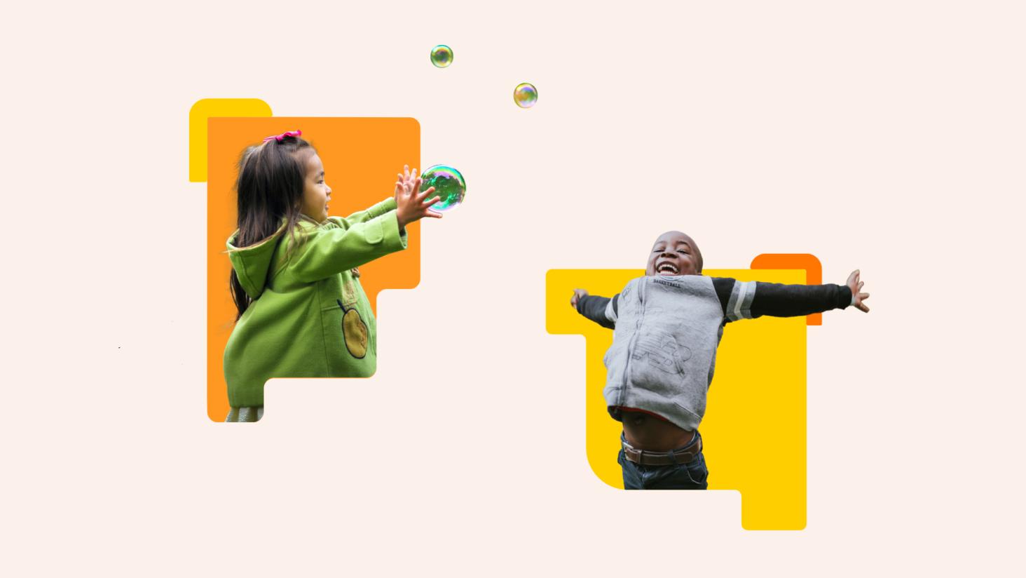
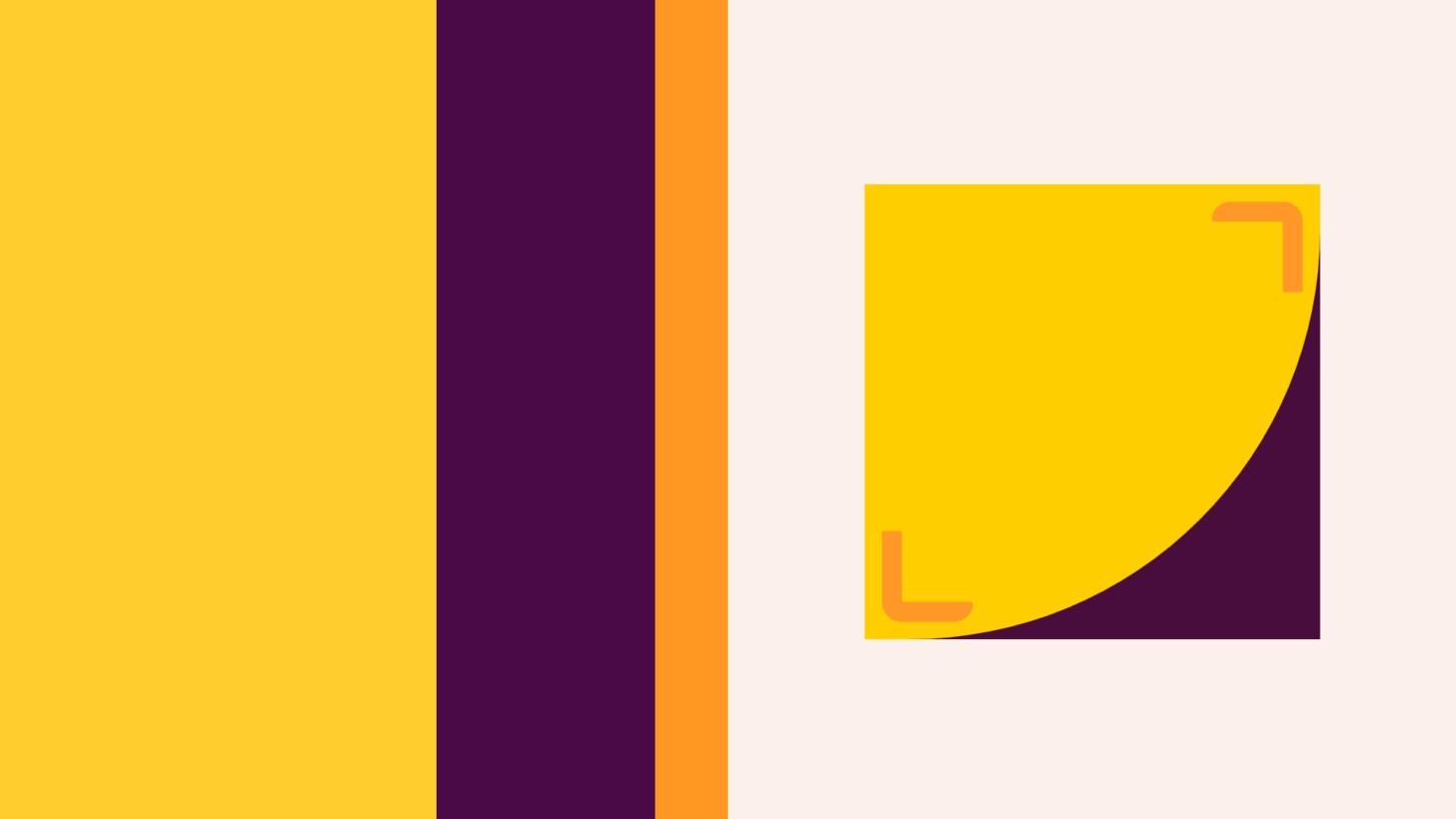
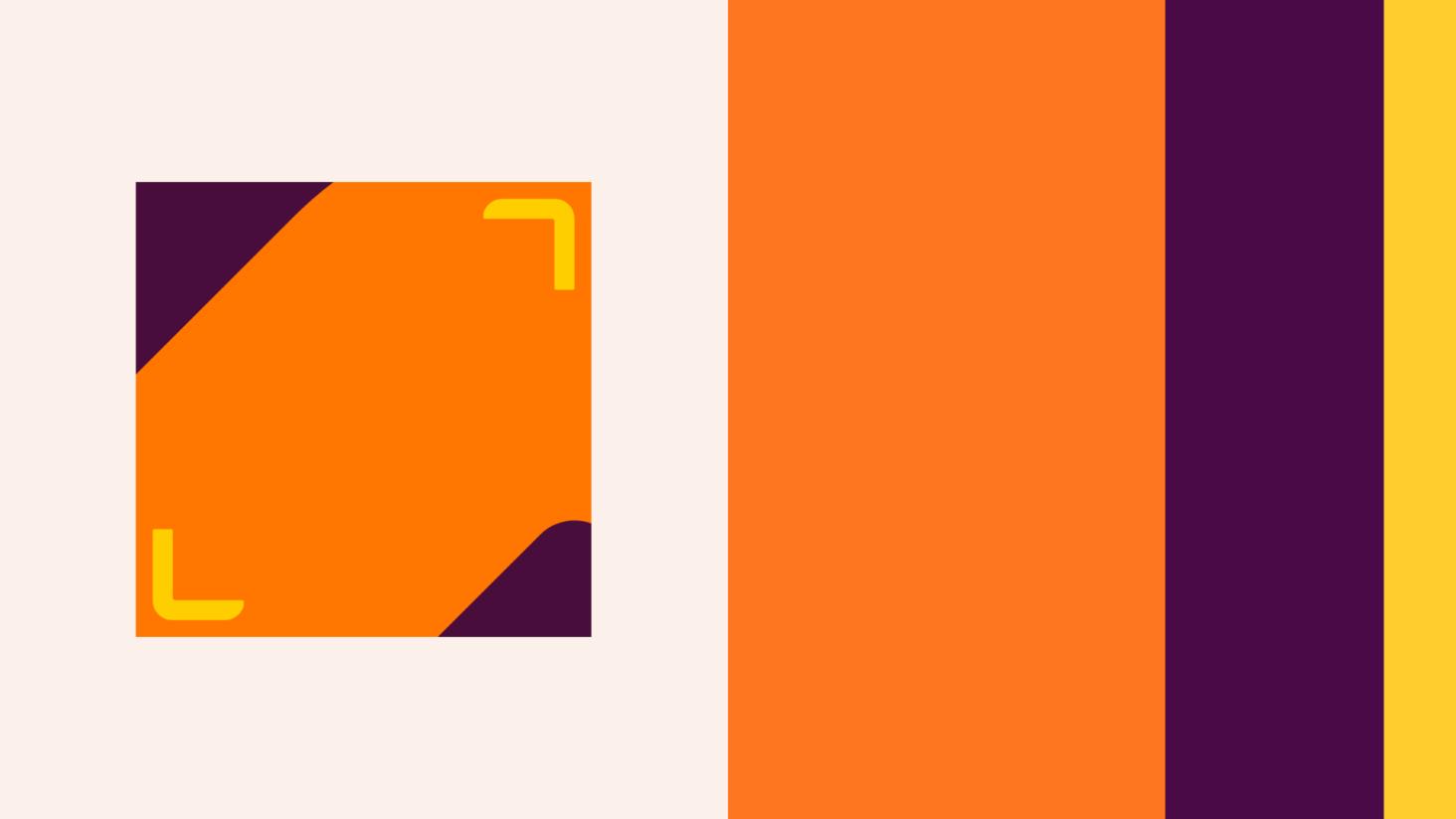
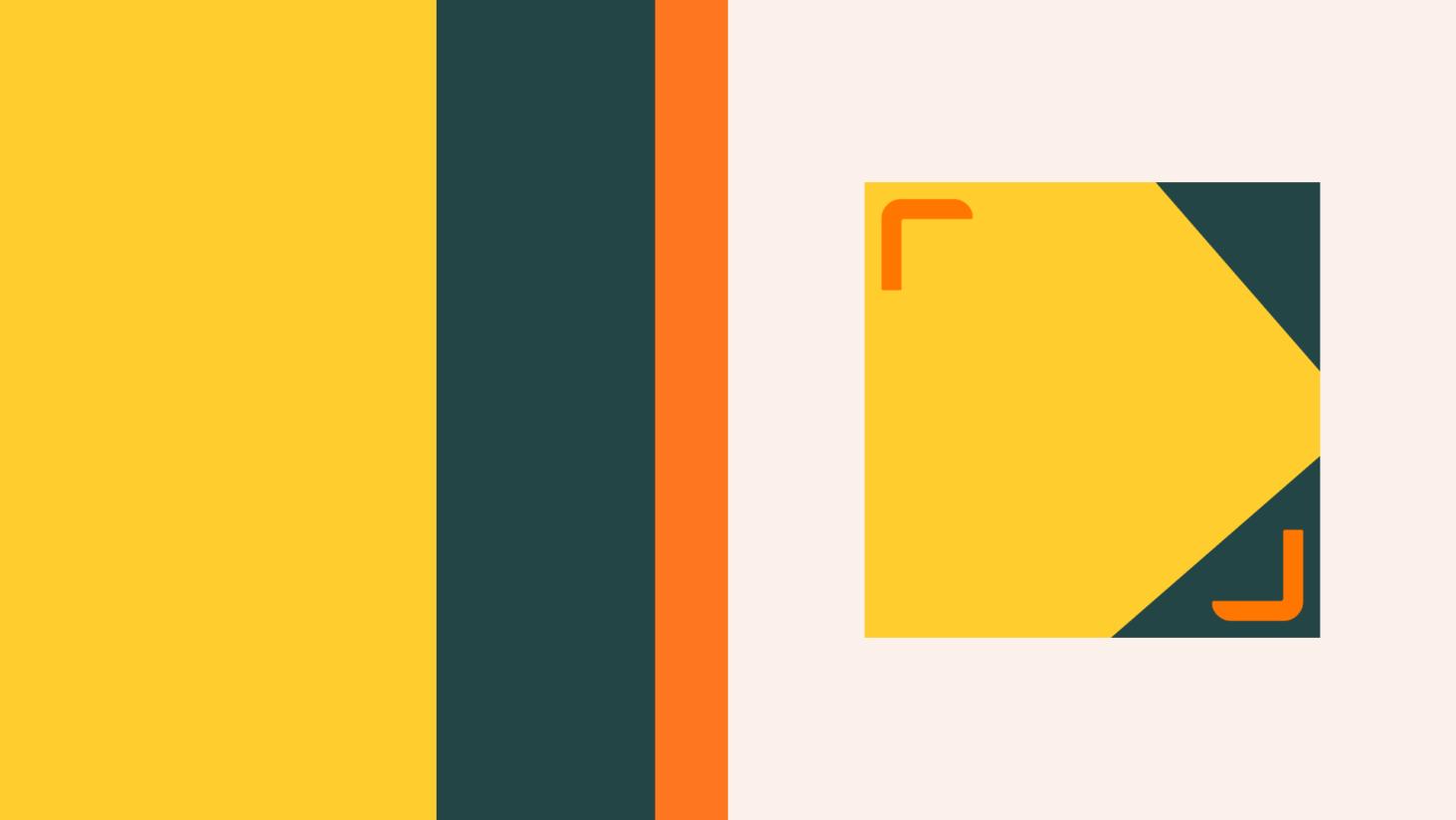
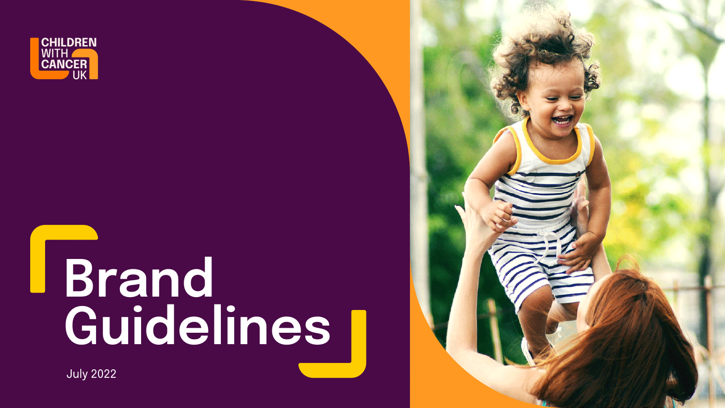
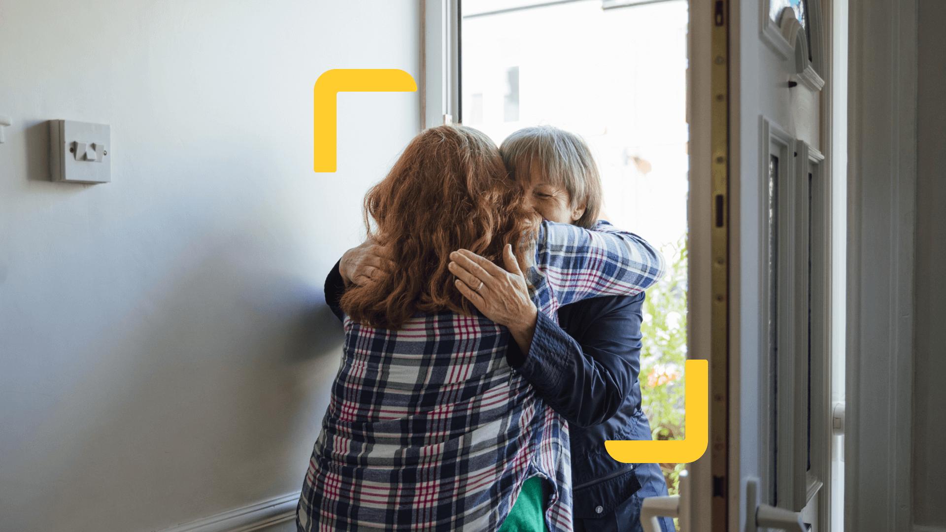
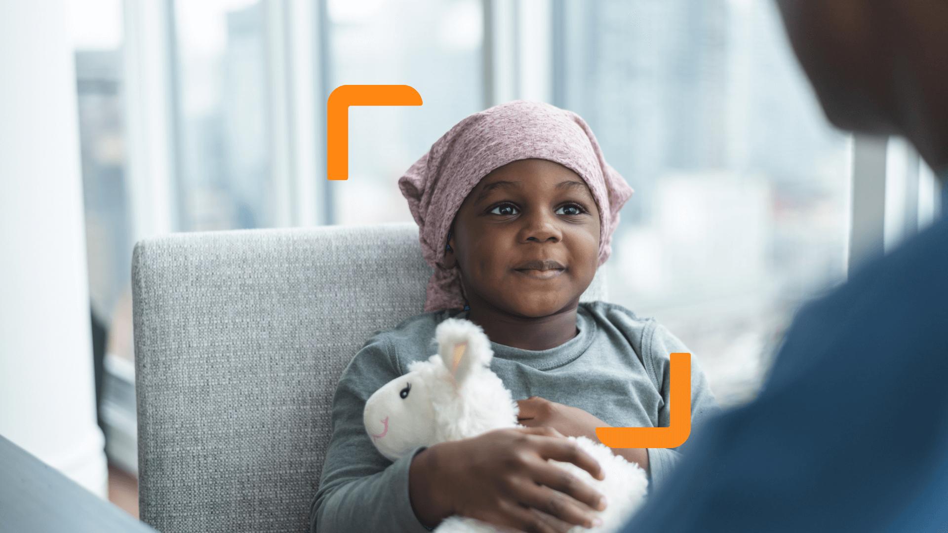
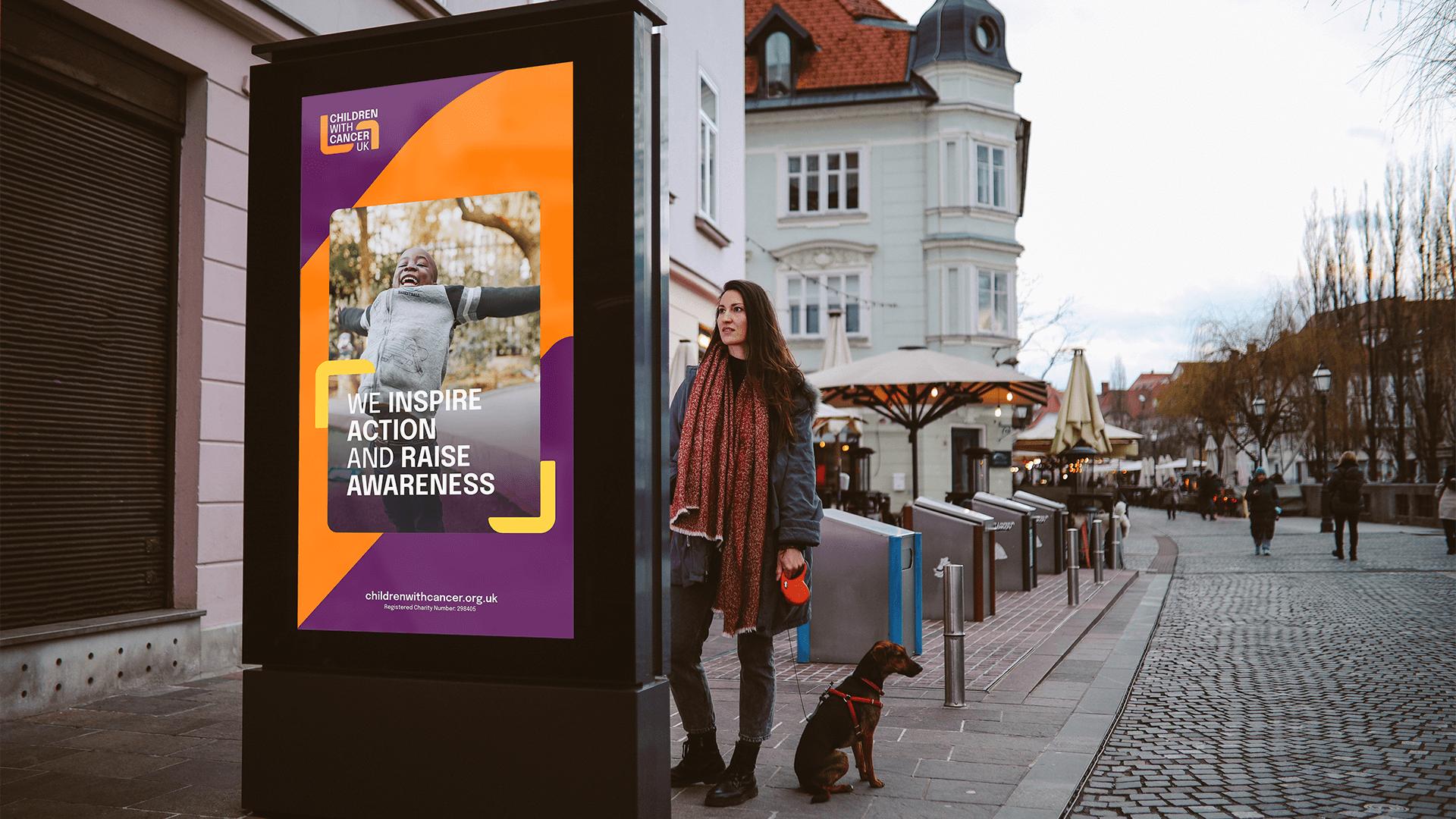
The final identity centres around a distinctive marque, two arms gently enveloping the organisation’s name in a supportive embrace.
This visual device operates on multiple levels:
- A literal symbol of care and protection
- A representation of the charity’s holistic support system
- A bold framing device that holds space for children, families and stories
- A flexible container for photography and campaign messaging
The embrace became the linchpin of the entire identity system. It forms a recognisable frame for imagery, a structural device for layouts, and the foundation for repeatable graphic patterns and textures across digital and print applications.
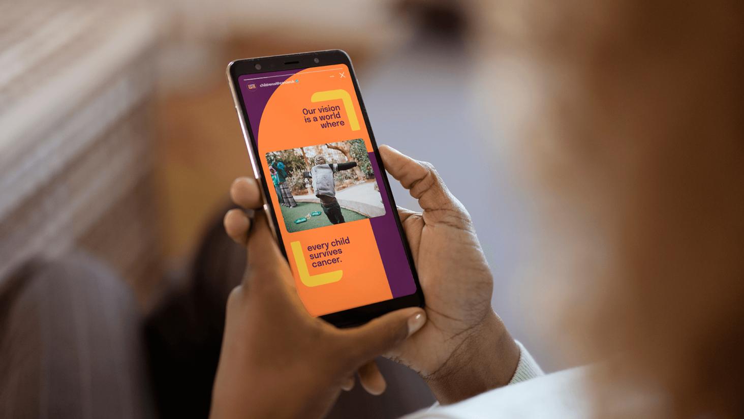
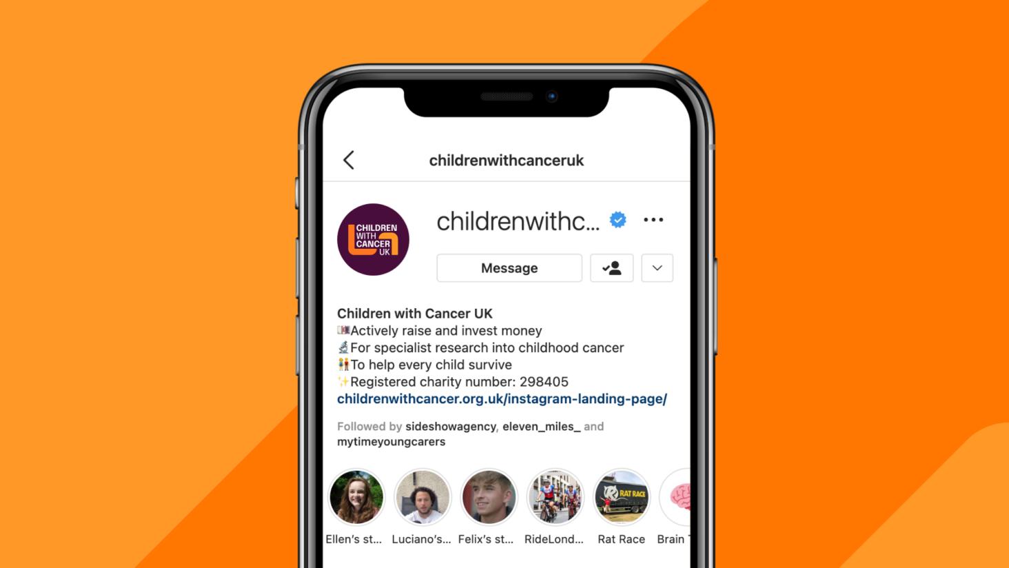
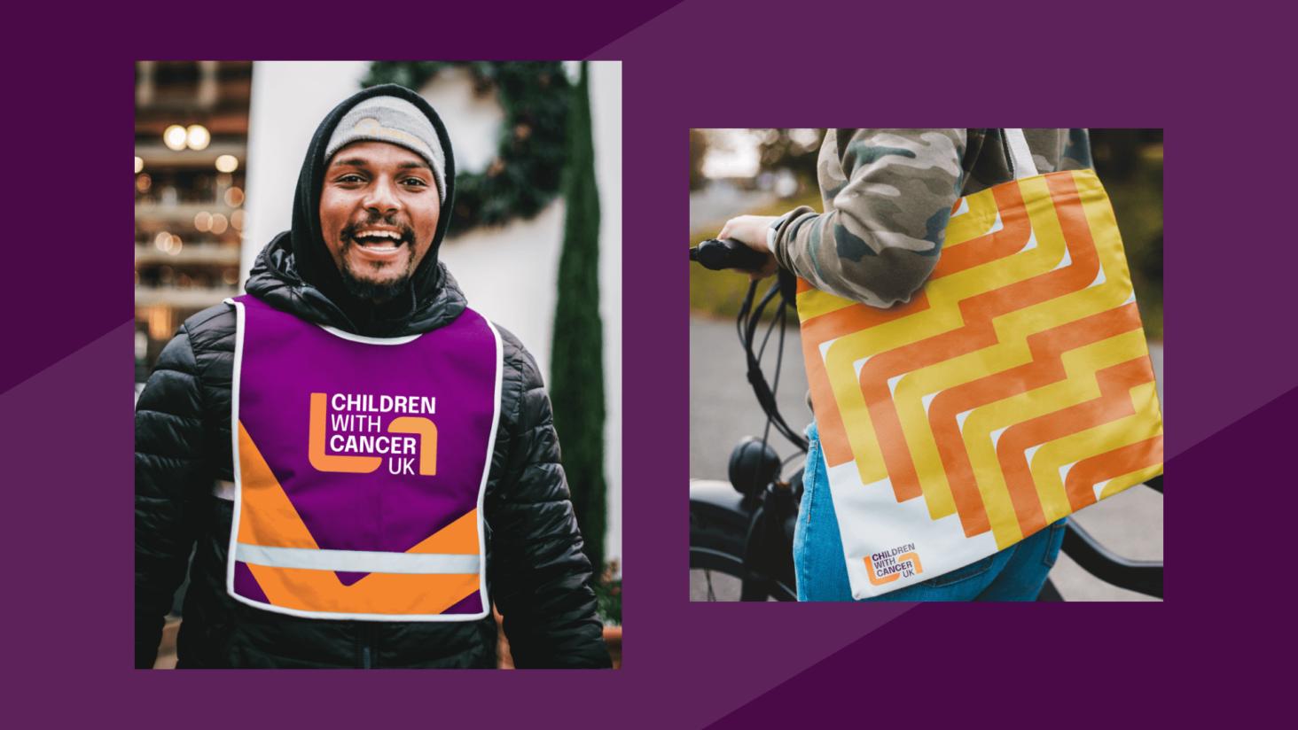
Beyond the logo, we developed a comprehensive visual system including:
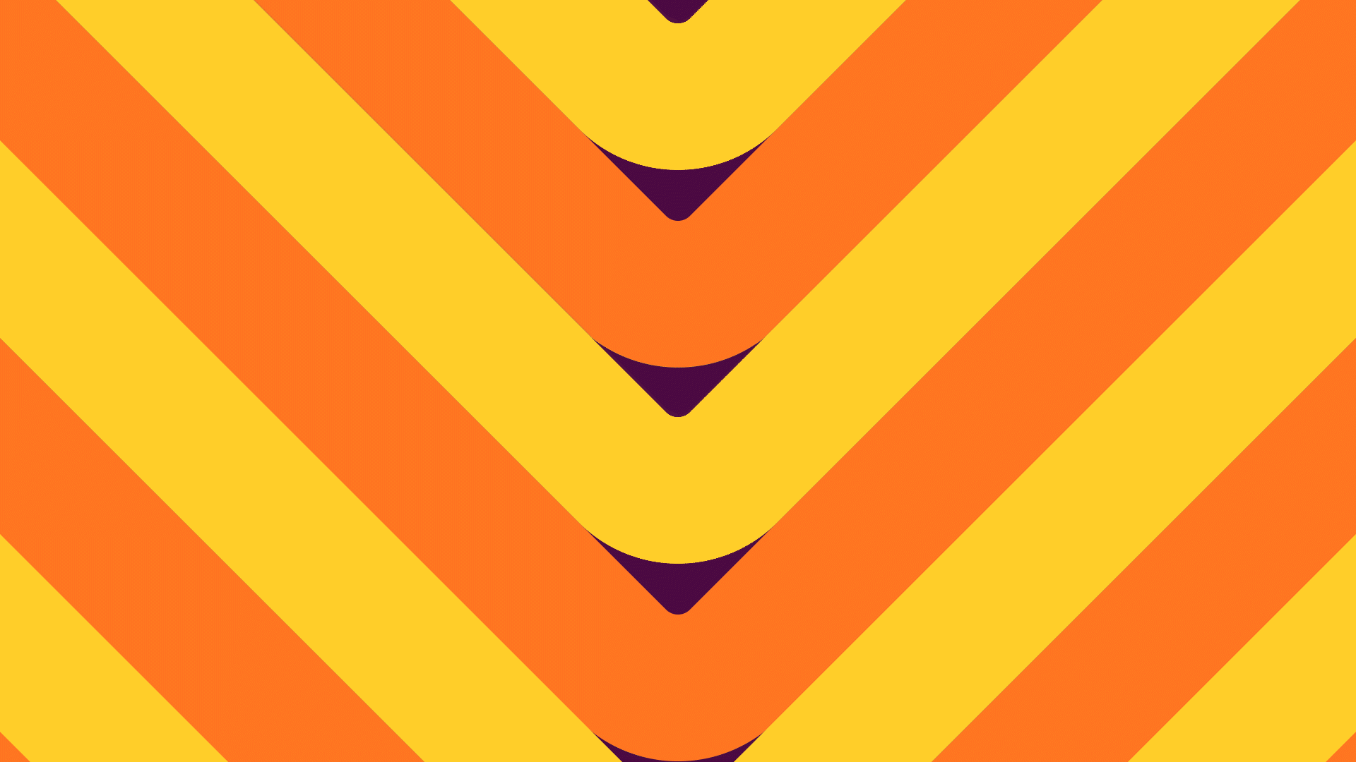
- A vibrant and optimistic colour palette
- Clear typographic hierarchy to strengthen messaging
- A flexible design framework for campaigns and fundraising activity
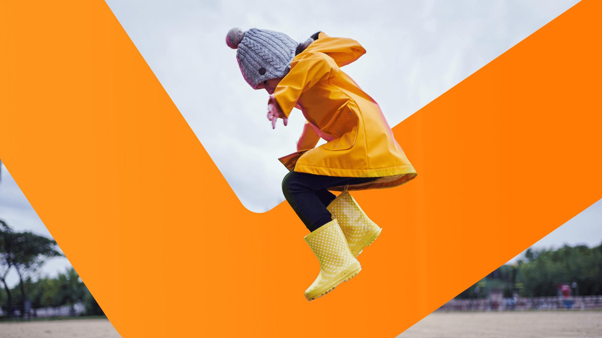
- Photography direction that balances honesty with hope
- Digital-first brand applications to support future growth
The system was designed to scale across fundraising campaigns, social content and large-scale awareness initiatives, ensuring consistency while allowing creative freedom.
The result is a confident, contemporary brand that feels hopeful rather than sentimental, strong rather than fragile, and unmistakably distinct within the sector.
By moving away from sector norms and leaning into strength, clarity and emotional intelligence, the charity now has a visual identity that better reflects the scale of its ambition and the magnitude of its work.
Most importantly, it provides a platform for the next chapter, supporting greater visibility, stronger engagement and increased recognition for a charity working tirelessly towards a future where every child survives cancer.
“I've had the pleasure of working with Studio Republic on a number of projects and am already looking forward to the next. They have the rare ability to combine fervent creativity with the process and precision required to establish creative that works. Whether it's a brand new look or a stand-out campaign they work with you to understand the real problem you're trying to solve and deliver solutions. And what's really brilliant is from the outset you know they share your passion for purpose - which can only result in success for everyone. I can't recommend them highly enough!”
Gemma Huddleston
Marketing Communications Director, Still Curious