The challenge
As a new initiative with two programmes ready to launch, we were challenged with creating a fun, effective and somewhat unexpected master brand design, whilst systemising a programme identity to support future growth. The solution would need to communicate across various audiences, from primary school children to head teachers.
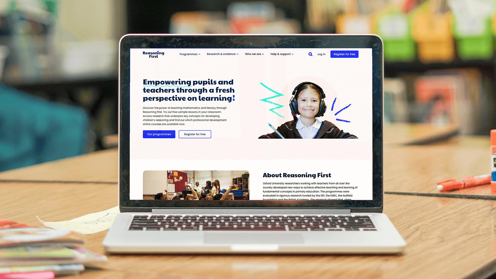
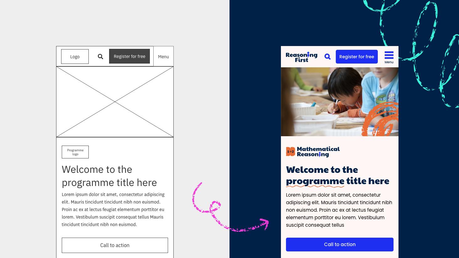
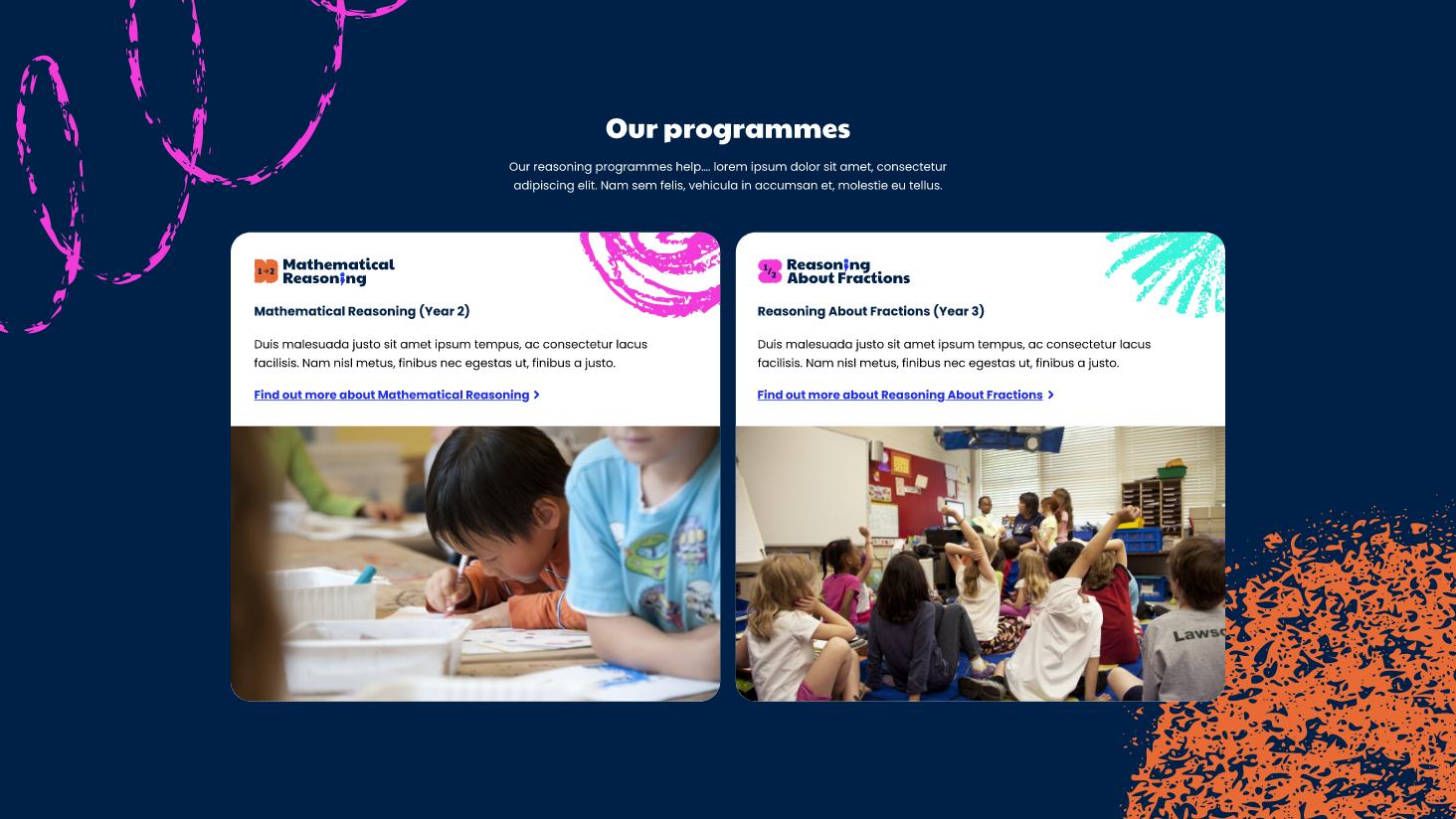
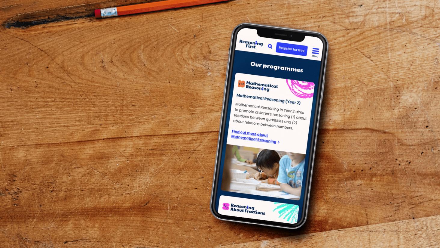
A vibrant and informative website was also required, with a focus on attracting and informing teachers about the proven benefits of the programmes and how they could incorporate them into their teaching.

The solution
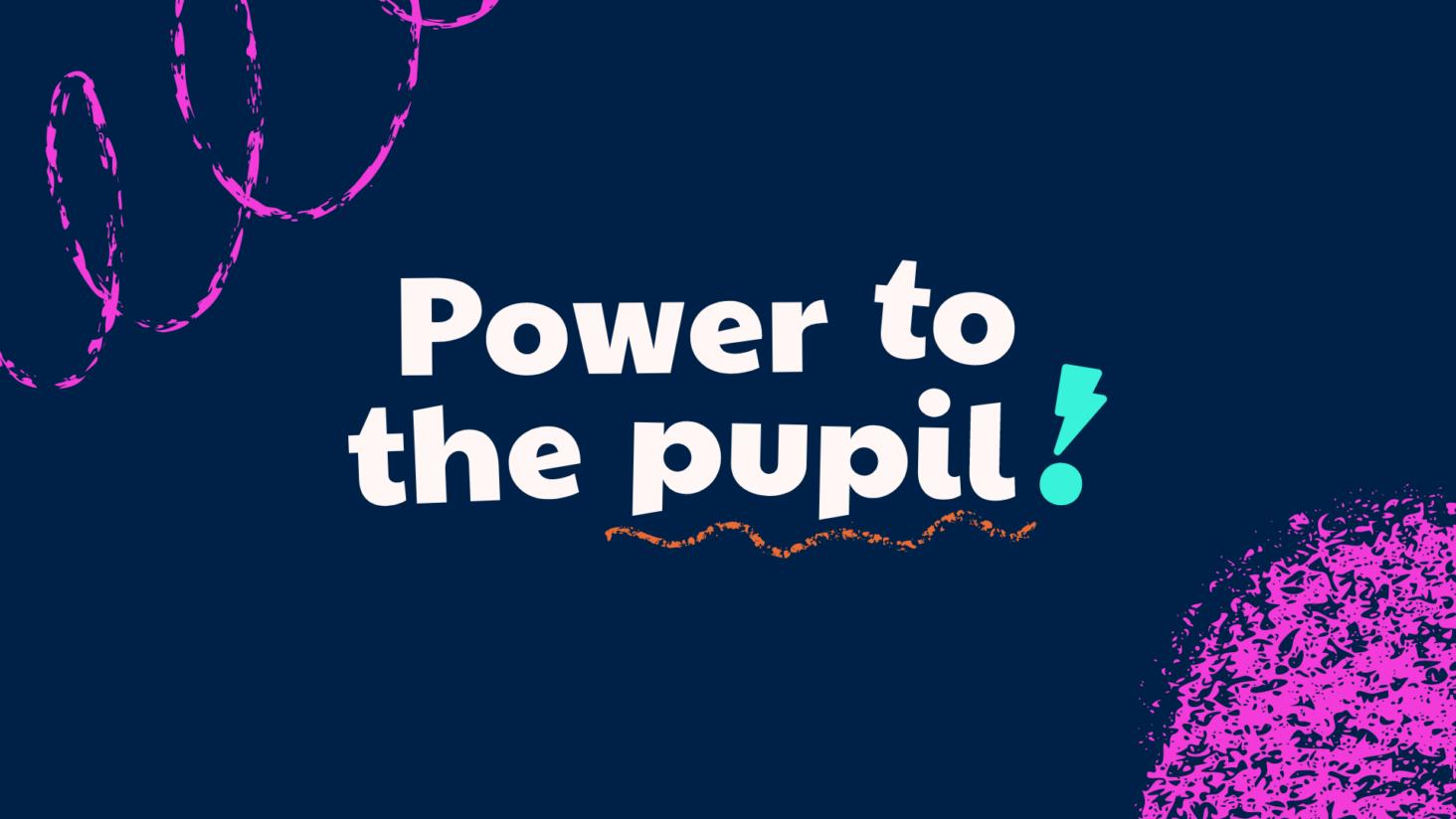
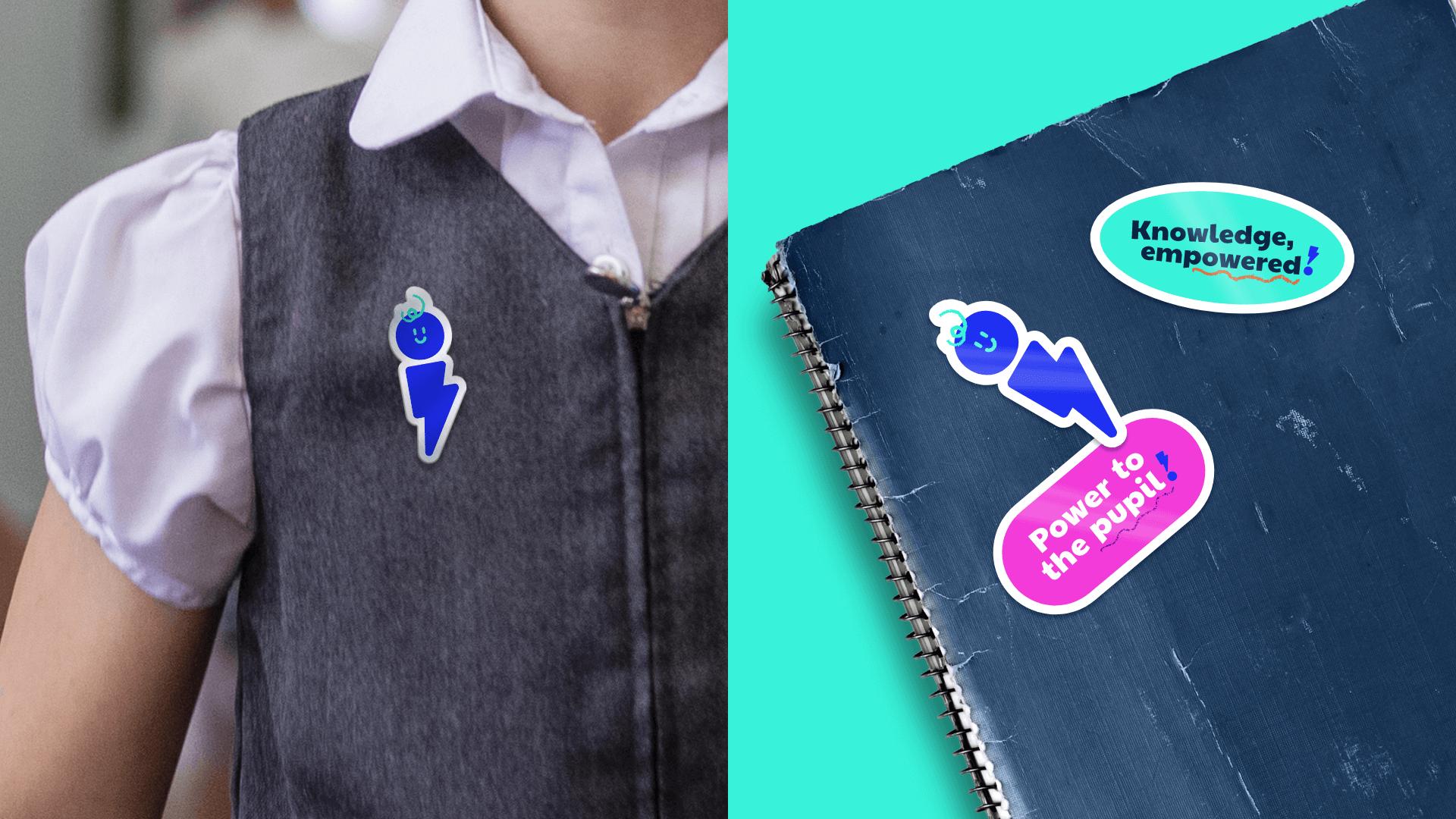
Throughout our brand workshop and immersion, we saw recurring themes of power and empowerment both in the teaching and the learning of these programmes. This insight enabled us to solidify the brand idea of “power to the pupil”.
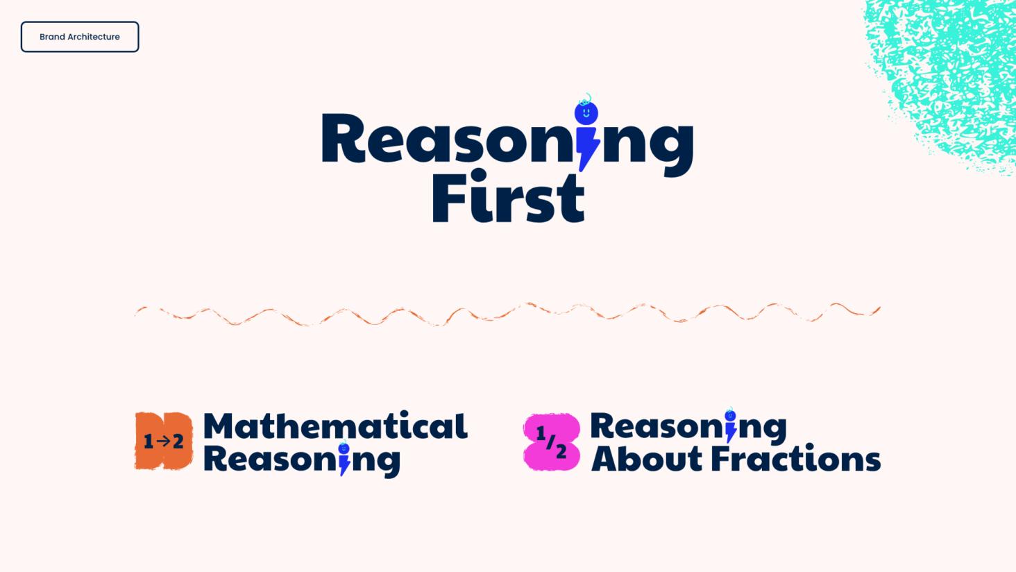
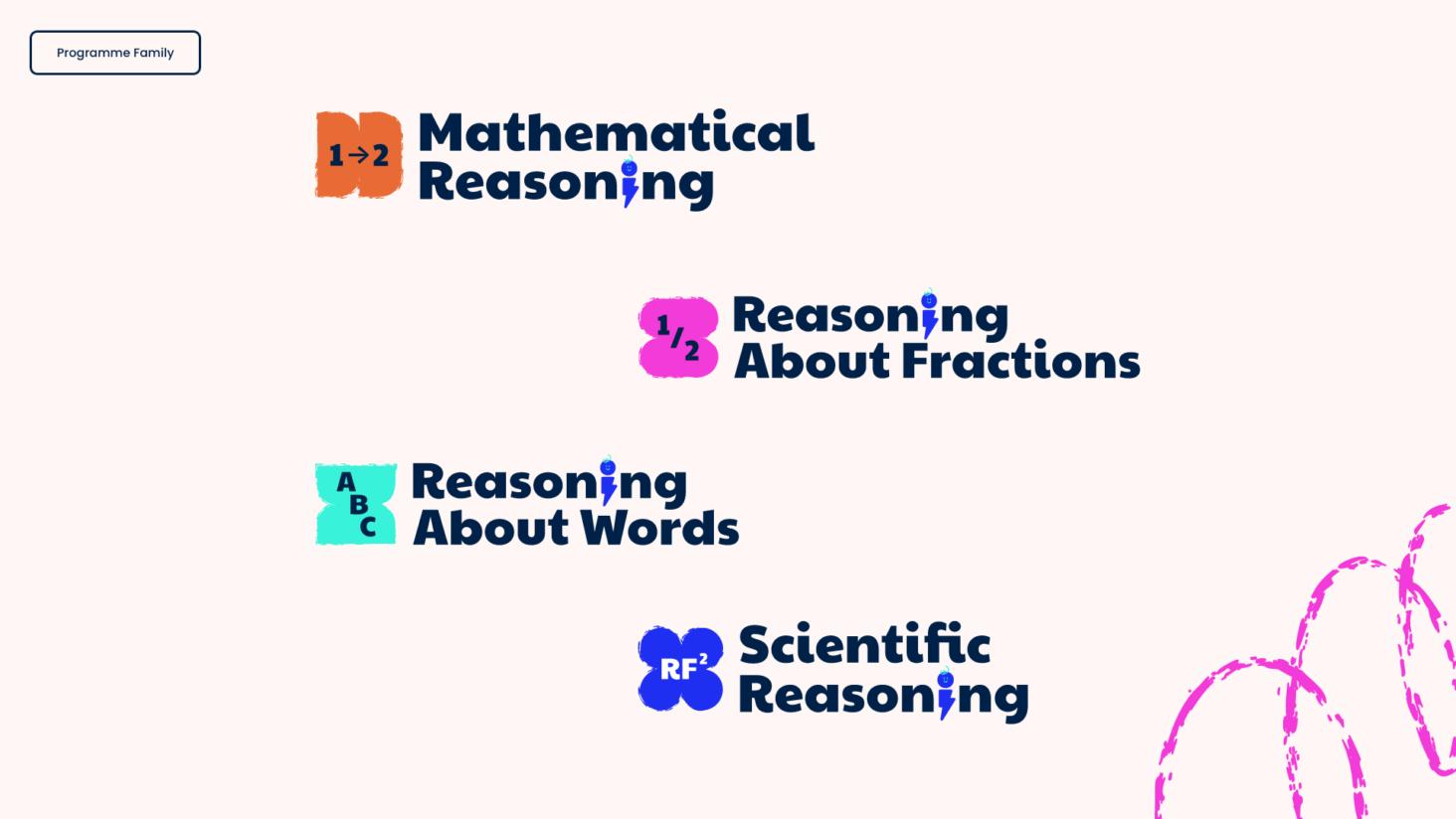
With this simple idea in mind, we crafted a brand design bristling with energy, movement and power. Every element, from the vibrant colour palette, expressive type and gestural crayon marks, were underpinned by this overarching concept. To add a touch of magic to the brand, we also introduced an energetic new mascot. A nod to Office Assistant ‘Clippy’, the bolt can act as a guide and a mascot – providing hints or encouragement for parents, teachers and children alike. To ensure consistency across programme sub-brands, we also systemised how programme logos should be structured for current and future programmes.
We further developed this concept when designing and developing the website, exploring how we could bring the brand elements to life through dynamic motion and interaction design.
Energising the user experience
In scoping we defined 3 key user groups for the site – teachers, head teachers and parents.
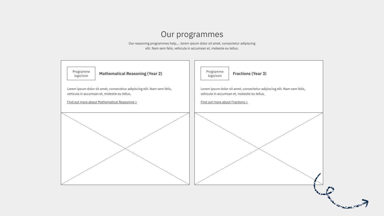
Within the task analysis of each of these we identified themes of requirements which essentially boiled down to ensuring that the site communicates who Reasoning First are, provides a clear understanding of the programmes they offer and their benefits, along with confidence provided through the research and evidence to support them.
Having this understanding would provide users with the information they require to make the decision to register interest via the sign up form which is the key conversion point on the site.
We achieved this through an accessible navigation structure that uses these actions as the menu links with the addition of help and support. Users are directed towards the programme pages which are easy to navigate through anchor links, enabling different user groups to quickly skip to specific pieces of information about the programme whether that be the benefits, training or resources. Clear calls to action are used throughout to direct users to ‘Register interest’ once they have gathered the information they require.
This simple and streamlined user journey removes any complication and enables all key user groups to quickly access information and complete the tasks they need.
