
The challenge
Ygam’s website serves as a vital touchpoint for its diverse audience of educators, parents, and young people. However, it faced significant challenges.
Despite a vibrant colour palette, some colour combinations posed accessibility issues, with users finding them too intense and distracting. As a defining feature of the brand, it required adjustments to balance its vibrancy with accessibility standards to uplift the user’s experience. Additionally, inconsistencies in applying the visual identity presented an opportunity to refine and enhance it for greater flexibility, consistency, and impact across the site.
User testing also revealed navigation difficulties. Users were struggling to locate resources due to excessive clicks and unclear pathways. Although hosting over 1,000 educational resources, filtering and accessing content on the site remained cumbersome and meant people weren’t able to find valuable content. Functional issues like slow loading speeds, limited search capabilities, and complex booking forms further hindered usability, undermining the overall experience and impact.

The solution
To address these challenges, we conducted a detailed accessibility review, using our colour checker tool to adjust the palette and improve contrast ratios, expanding the range of accessible combinations. This enhanced the site’s visual flexibility, making it easier for all users to engage with content.
We refined Ygam’s visual identity by using the circular icon as the foundation for a cohesive graphical system, ensuring consistency across buttons, icons, and holding shapes. Imagery was standardised with digital-native aspect ratios to align with user expectations, while the introduction of “stacks” created a clear visual hierarchy inspired by app interfaces. Gradients were defined and applied thoughtfully to add a modern aesthetic without overwhelming users, adding flexibility into the visual identity.
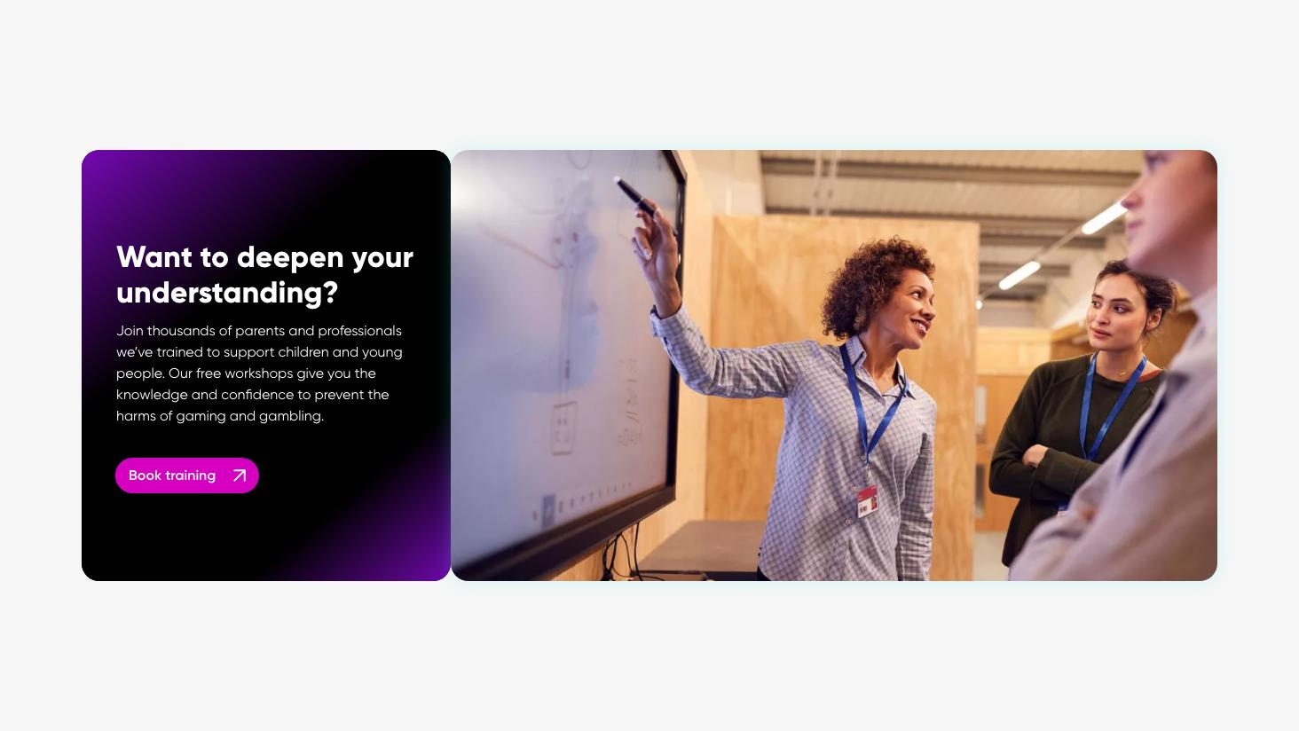
User experience improvements focused on simplifying navigation, reducing clicks, and making all options easily visible. We used feedback from user testing to inform these changes to ensure it aligned with needs and expectations. This helped to shape everything from streamlined navigation to a more intuitive training programme booking system, enabling more people to access Ygam’s vital resources.
Lastly, the web build prioritised functionality, by introducing advanced search and filtering tools, Salesforce CRM integration, and resource preview capabilities. Speed, responsiveness, and interactivity were optimised to deliver a seamless experience, and the site was designed to meet WCAG accessibility standards, ensuring inclusivity for all users.
The result is an evolved charity website that embraces a more refined visual identity and prioritises user experience. With content, resources and booking systems easy to find and follow, Ygam can continue to expand and grow its reach, helping to protect more young people in our digital world.


“Working with Studio Republic on the development of Ygam's new website has been a rewarding and enjoyable experience. Their expertise significantly enhanced our website’s presentation, capabilities, accessibility, and overall user journey. The team consistently demonstrated professionalism, building strong relationships with our staff to ensure that communication was clear, consistent, and effective throughout the project. What truly set Studio Republic apart was how they embedded themselves in our charity. Their genuine passion for the third sector was evident at every stage, ensuring that every decision and design element aligned with our mission. Their collaborative approach met all expectations, and we are grateful for the positive impact they have had on our work. We highly recommend Studio Republic to any organisation seeking a dedicated, innovative partner to elevate their digital presence.”
Dan Bliss
Director of External Affairs
Looking to strengthen your charity’s brand, website, or user experience? Get in touch to find out how we can work together
Next Project
