
The challenge
Whilst the charity’s focus and determination hasn’t wavered in over 40 years, their brand identity had become diluted and restrictive, meaning it no longer represented their progressive and collaborative ethos.
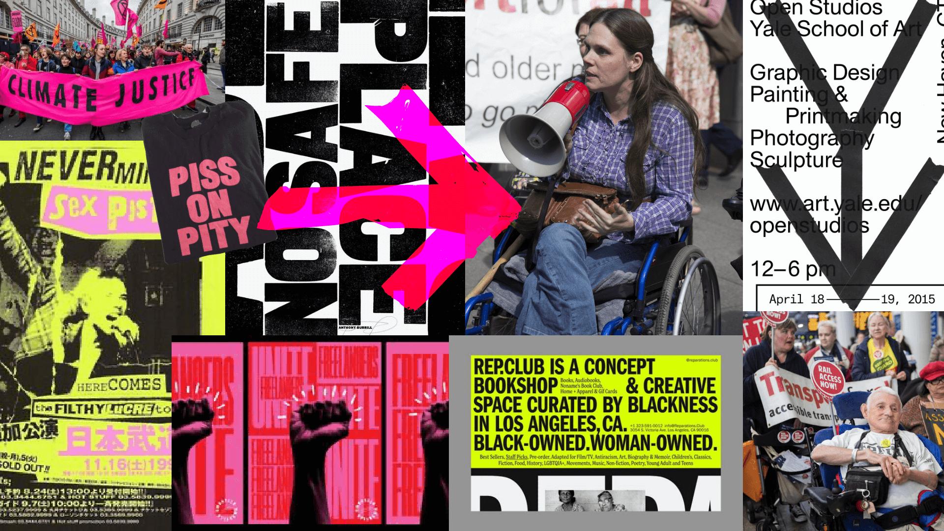
Having become a ‘patchwork’ of ideas and directions, the identity was inconsistent, lacking impact and an ownable visual style. This meant they were often mistaken for transport providers or a government body. Our challenge was to amplify their punky roots, creating a bold, “in your face” charity brand, housed in an ordered yet flexible system.
The solution
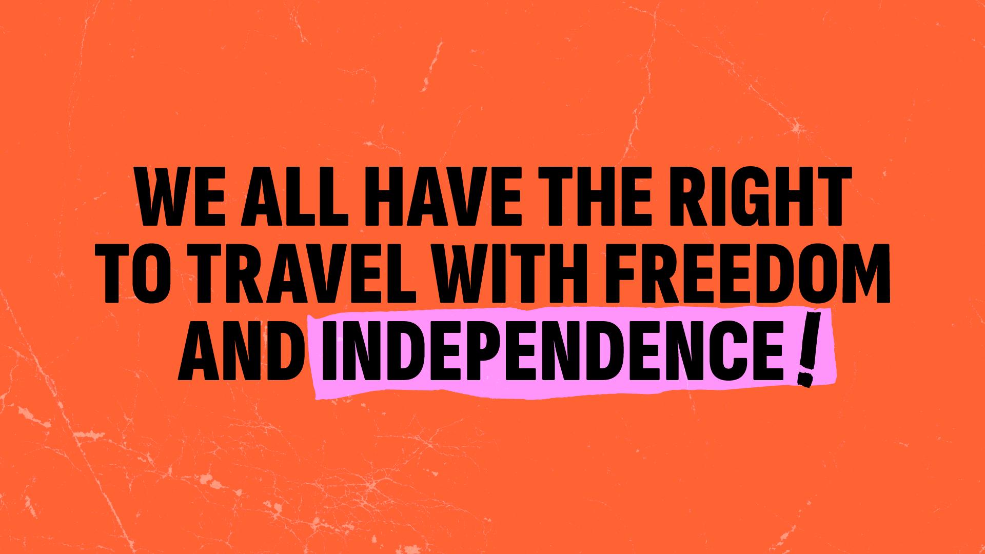
Following our brand scoping workshop, we redefined the charity’s brand as ‘bold, disruptive, impactful and collaborative’, underpinned by the creative concept, ‘rebels with a cause’. This idea communicates Transport for All’s activist roots, but also their staunch vision of transport justice for disabled people.
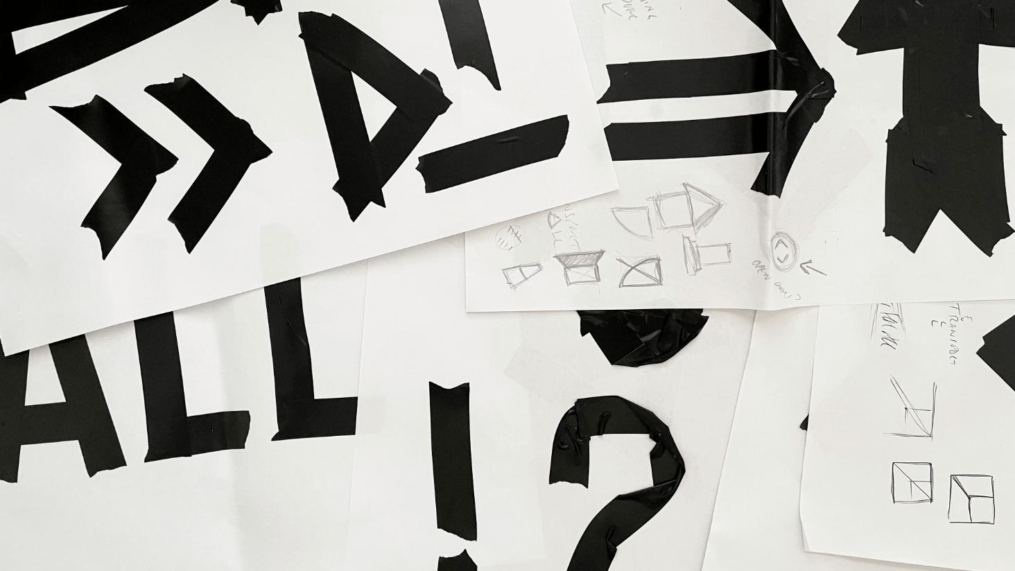
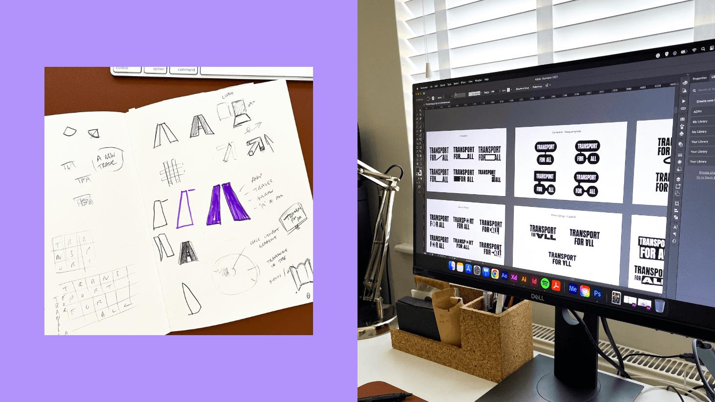
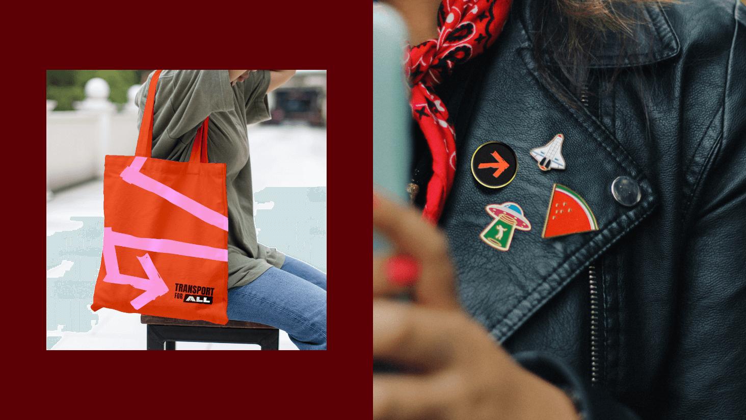
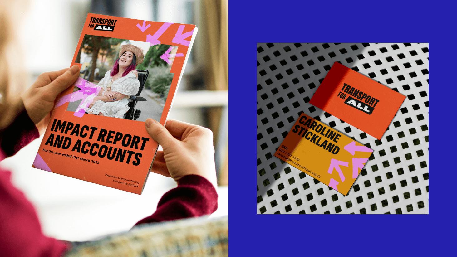
These defining features led to creation of a new logo that speaks to DIY protest posters and punk zines. The varying type widths and weights feel hand-set, with the strip of electrical tape highlighting the importance of the ‘all’ in their name.
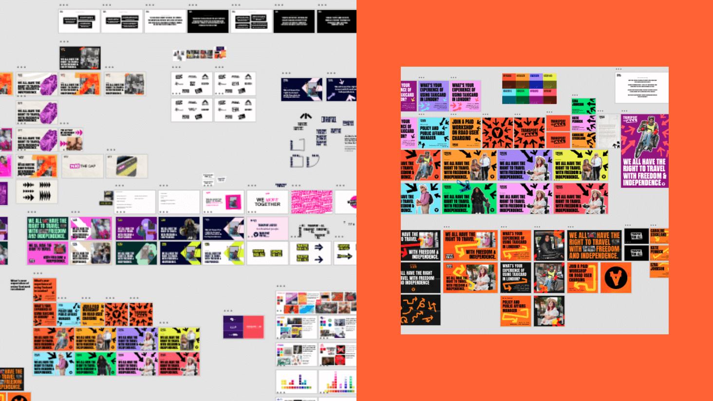
The electrical tape motif, (inspired by the handmade placards raised at their “Rail Access Now” campaign), extends into the broader identity. Referencing transport signage, we created a suite of tape arrows and strips to highlight information or grab attention, with a fluid sense of direction. We also introduced a new flexible holding device for imagery, based on a simplified overlapping placard, to create endless variations that combined flexibility and consistency.
Lastly, the typography was completely reimagined, adding personality, legibility and structure. Drawing comparisons with the highly condensed typefaces of protest posters, its wider characters and large counters ensured we could balance style, uniformity and readability.

User experience
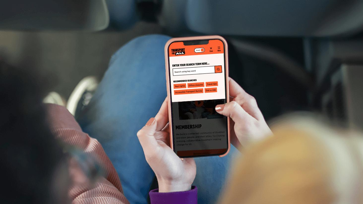
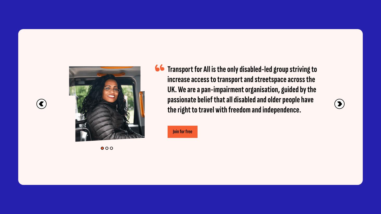
With a radical new brand in place, we moved on to developing a sleek user experience for the charity’s website. Through user surveys, we found that the majority were looking for information about their rights, shared issues and challenges, and how they can get involved in campaigns and events. Their key frustrations were centred on accessibility – tackling this was key.
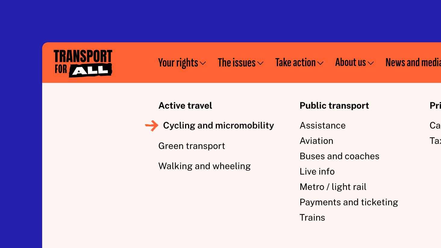
We worked with Transport for All’s team to redefine their website’s information architecture to refocus on three areas; ‘your rights’, ‘the issues’ and ‘take action’. Rooted in these key areas, the menu was optimised to give users quick access to get help, join or donate. The new structure was tested with users to refine the experience and smooth over any sticking points.
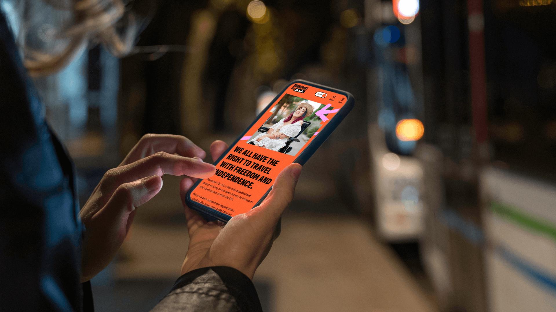
Accessibility was at the forefront throughout the process. Our research showed that there was a preference for muted colours and customisation for autistic users on the site. So, in order to balance the vibrant colours of the new brand, we introduced a ‘vivid’ to ‘soft’ colour toggle which reduces the global colour saturation, enabling users to choose how they wanted to view the site.
The website integrates Fundraise Up for its donation journey, a class-leading giving platform which uses AI and machine learning to optimise donation amounts and conversions. This system, and the membership sign up form, integrate seamlessly with TFA’s CRM system, Nutshell.

“Working with Studio Republic has helped make our website as accessible and powerful as our work. We are delighted that our new brand reflects our proud history of disabled people's protest. Both the brand and our website are helping spread our message - that transport should be accessible to all.”
Caroline Stickland
CEO - Transport for All
Next Project
