Improving access to frontline legal advice and advocacy services for women
The challenge
Formed in 1975 by a group of legal workers, Rights of Women is a charity dedicated to providing free legal advice and information to women. Their important work ensures that women across England and Wales experiencing violence against women and girls (VAWG) have increased access to justice.
We had the opportunity to collaborate with Rights of Women to elevate their brand and improve overall accessibility. Working within a reduced timeframe, we focused our efforts on the core challenges and creating powerful solutions that would have the greatest impact.
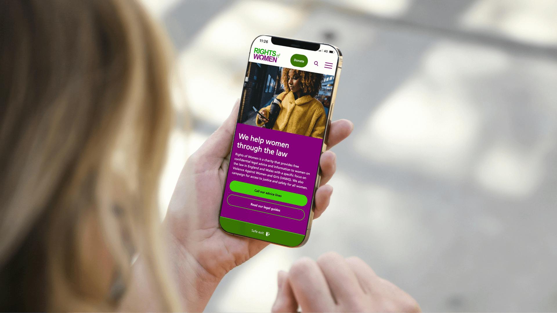
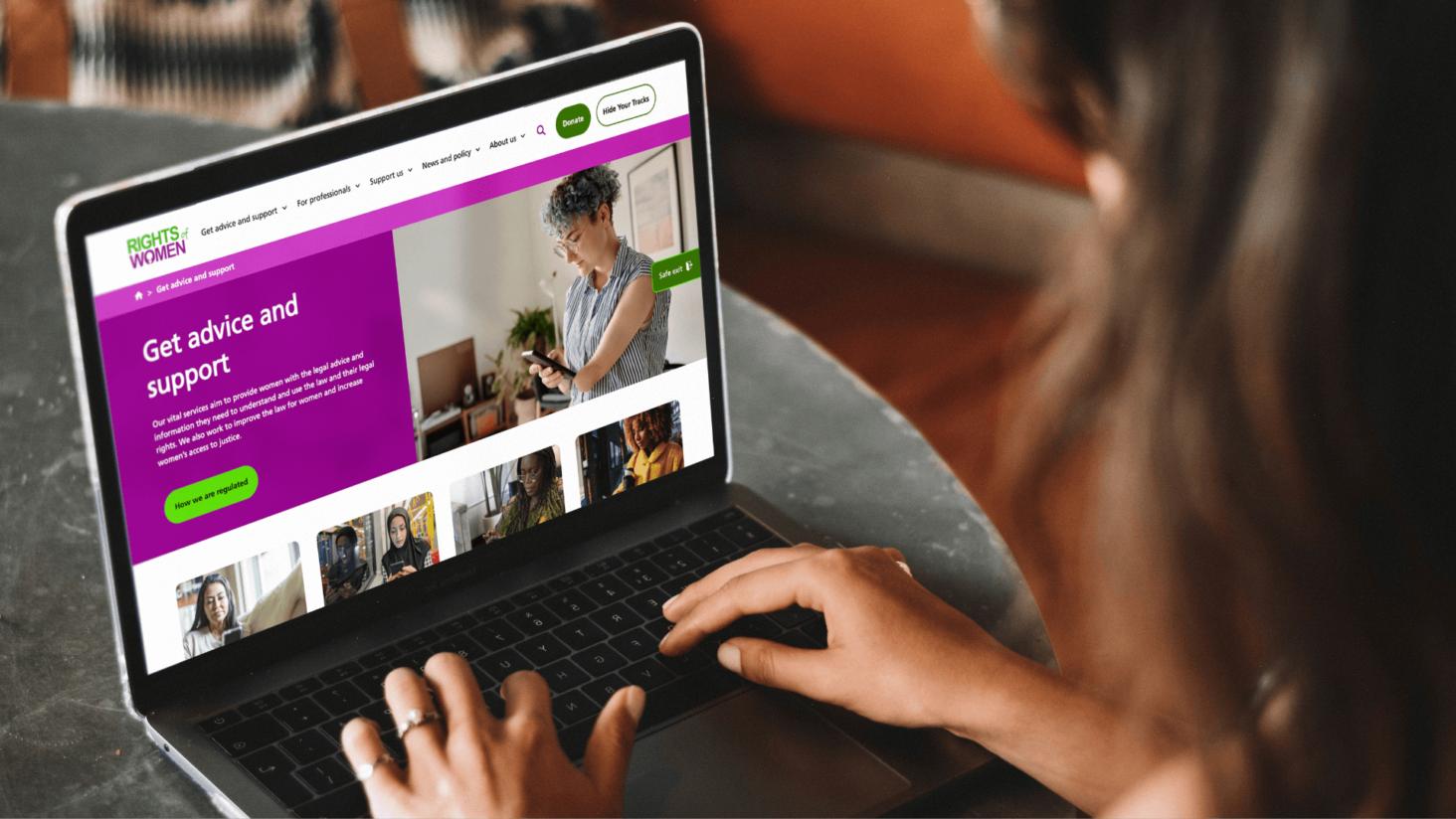
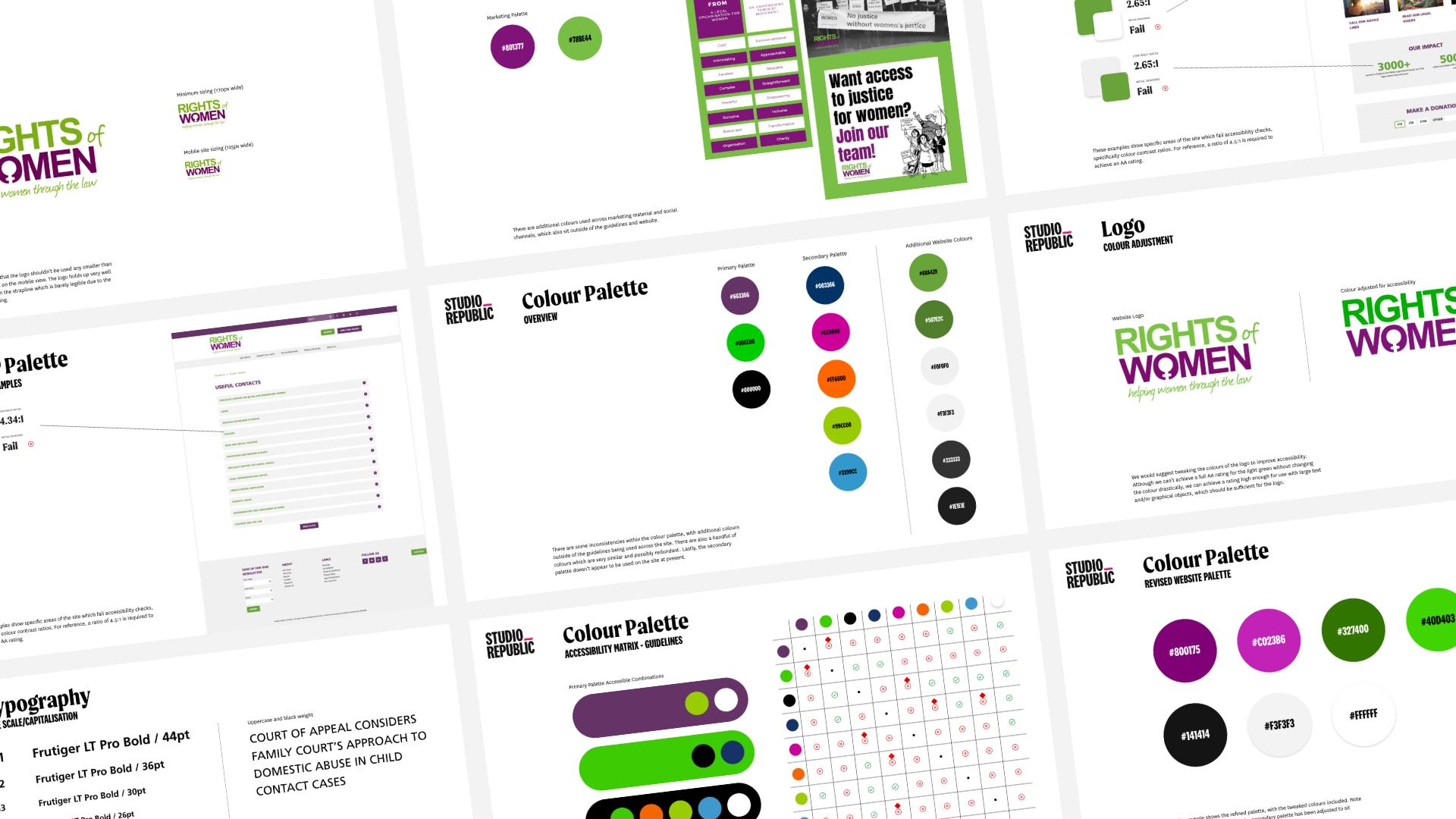
Starting with a full brand review, we were able to identify several accessibility and readability issues. This included inconsistent colours that failed colour contrast checks, a lack of defined type scale and an overuse of capped text that added a confrontational tone. These elements created a series of barriers that limited the opportunities for people to engage with the charity’s incredible services and purpose. The charity was also keen to address the ‘blockiness’ of the UI elements on their website that didn’t align with their open and approachable values.
With these challenges identified, we were ready to start working toward solutions!
- Brand development
- UX design
- Web design & build
- UX & QA testing
The solution
Firstly, we turned our focus to the colour palette. We worked to establish a refined palette with an AA colour contrast ratio that would be applied to their logo and across their site. With a spread of 14 colours in use, we were able to streamline this to seven core brand colours. We then created a simple matrix to show which colours could be used together, so the team had a clear guide to promote ongoing consistency.
Next, we set out to tackle the type scale issues. We removed the strapline from the logo and instead integrated this into the website copy. This gave the logo the space to breathe and improve legibility. We then introduced a type scale that set out a clear information hierarchy and supported enhanced usability and accessibility.