Using typography as a catalyst for positive change

Introduction
Typography has always had the power to make people feel something. Long before I knew what the word even meant, I found myself drawn to the way type could tell a story. From charity posters and campaign leaflets to album covers and community newsletters, letterforms have always carried emotion, personality and intent. The way words are styled can say just as much as the words themselves.
For charities, this emotional connection is particularly powerful. Typography shapes how supporters see your brand, how they engage with your message and how they connect with your purpose. It can evoke trust, compassion or urgency, all through the careful choice of style, weight and spacing.
In the digital age, the role of typography has evolved even further. With greater access to creative tools and an ever-expanding range of typefaces, charities now have more opportunity than ever to express who they are and what they stand for. Designers are using type not only to make information clear and accessible, but also to inspire empathy, raise awareness and drive change.
This article explores how socially conscious type design can help charities amplify their voice, strengthen their campaigns and create meaningful connections with the people who matter most.
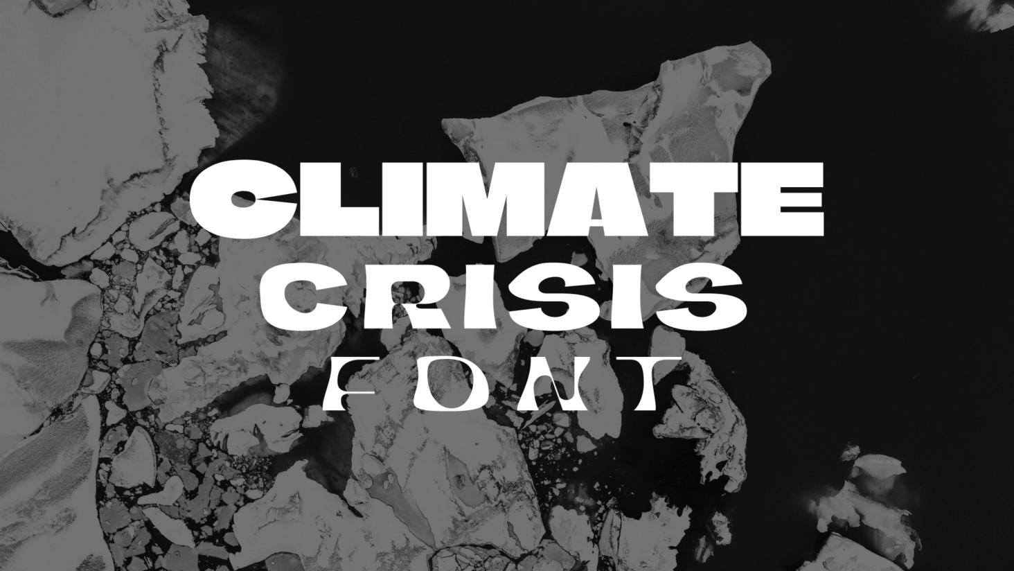
The Climate Crisis Font
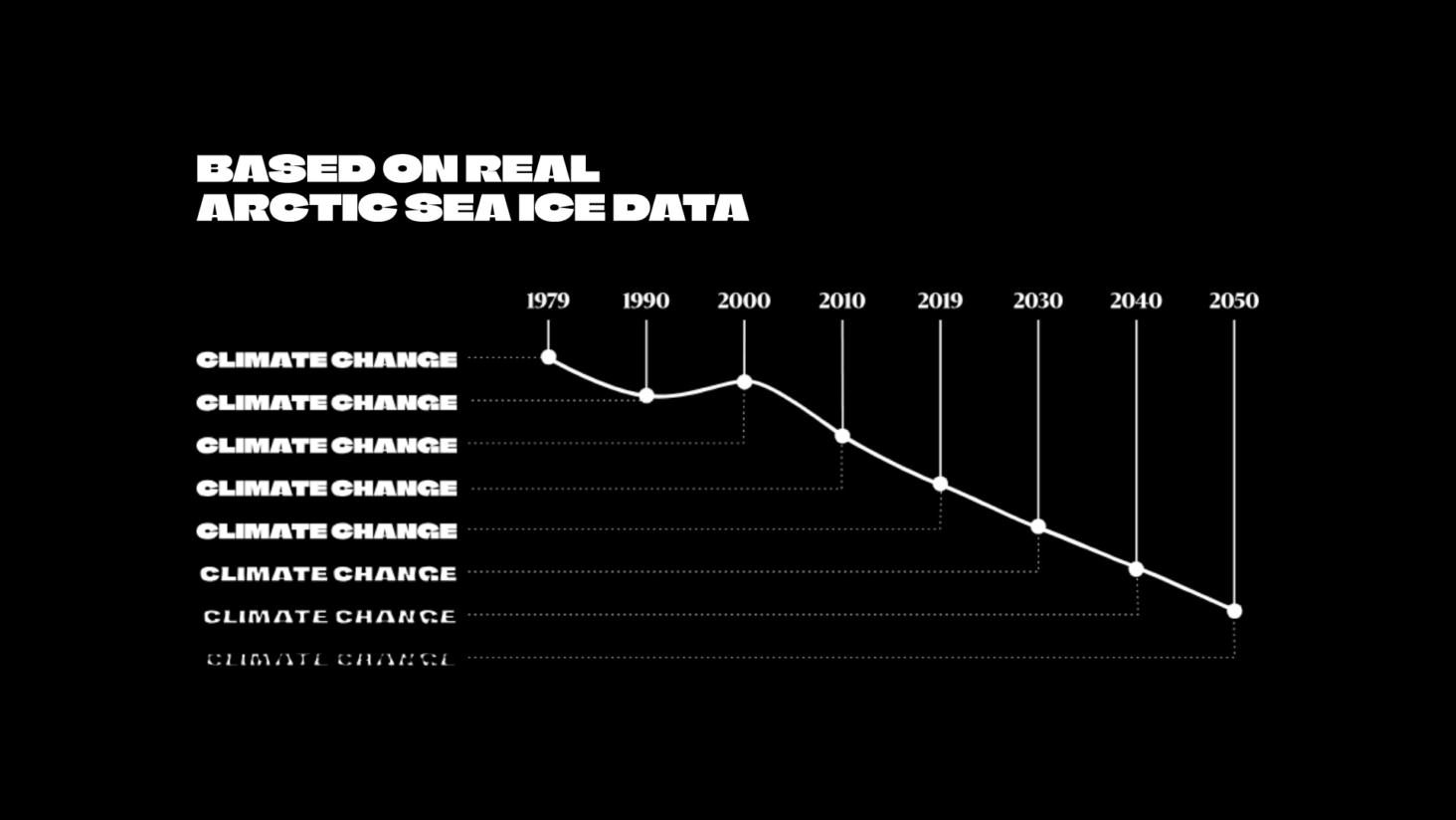
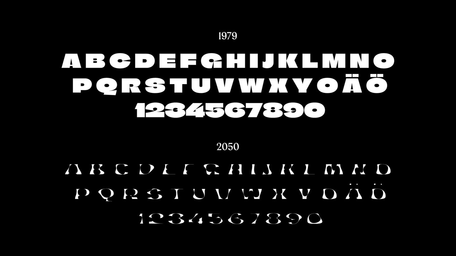
Helsingin Sanomat, the Nordic’s largest newspaper, has created an innovative typeface called “The Climate Crisis Font”, which aims to provide a tangible representation of the urgency of climate change. The font’s weight dynamically changes based on data from the National Snow and Ice Data Center (NSIDC), spanning the years 1979 to 2019, and projections by the Intergovernmental Panel on Climate Change (IPCC) up to 2050. By doing so, it shows the anticipated decline in Arctic sea ice due to climate change according to current forecasts.
Using information from NSIDC and IPCC, the design is grounded in scientific data. The heaviest font weight corresponds to the minimum extent of Arctic sea ice recorded in 1979, which marks the beginning of satellite measurements. The lightest font weight represents IPCC’s 2050 forecast, predicting that the Arctic sea ice minimum will have diminished to a mere 30% of its 1979 extent by that time. This approach visually underscores the gravity of the ongoing climate crisis.
Find out more about the project and download The Climate Crisis Font here.
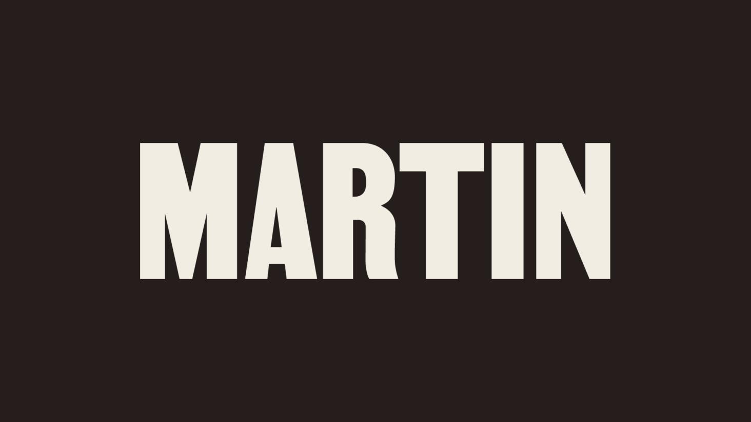
Martin
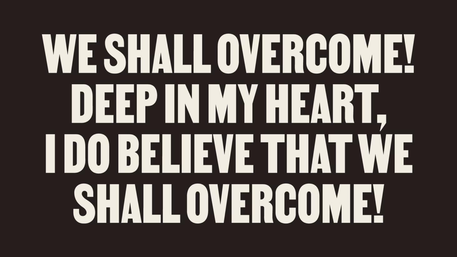
Martin is a non-violent typeface designed by Vocal Type founder Tré Seals, drawing inspiration from the iconic posters of the 1968 Memphis Sanitation Strike. The strike, predominantly led by Black sanitation workers, commenced on February 12, rallying for their union’s recognition, improved wages, and safer working conditions following the tragic deaths of two colleagues.
During the march, the striking workers carried posters bearing the statement, “I AM A MAN”. On April 3rd, Reverend Martin Luther King Jr. joined their cause delivering his iconic speech, “I’ve Been to the Mountaintop”, declaring, “The masses of people are rising up.”
The next night, Martin Luther King Jr. was assassinated, just one day before a massive rally was scheduled to take place. On April 8, Coretta Scott King, his widow, led around 20,000 marchers through the streets of Memphis, holding posters with the message, “HONOR KING: END RACISM!” The strike finally came to an end on April 16, with the city conceding to union recognition and wage increases.
The origin of the powerful “I AM A MAN” posters remains somewhat of a mystery, thought to have emerged from a collaborative effort between union officials and civil rights activists. Around 400 copies of the posters were printed, leaving an indelible mark on the course of history.
Vocal Type is a type foundry committed to diversity and equality, with each typeface highlighting a piece of history from a specific underrepresented race, ethnicity, or gender—from the Women’s Suffrage Movement in Argentina to the Civil Rights Movement in America. Learn more about their work here.

Redaction
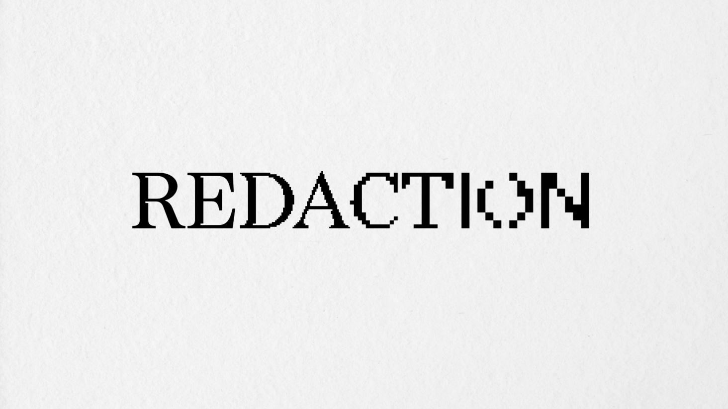
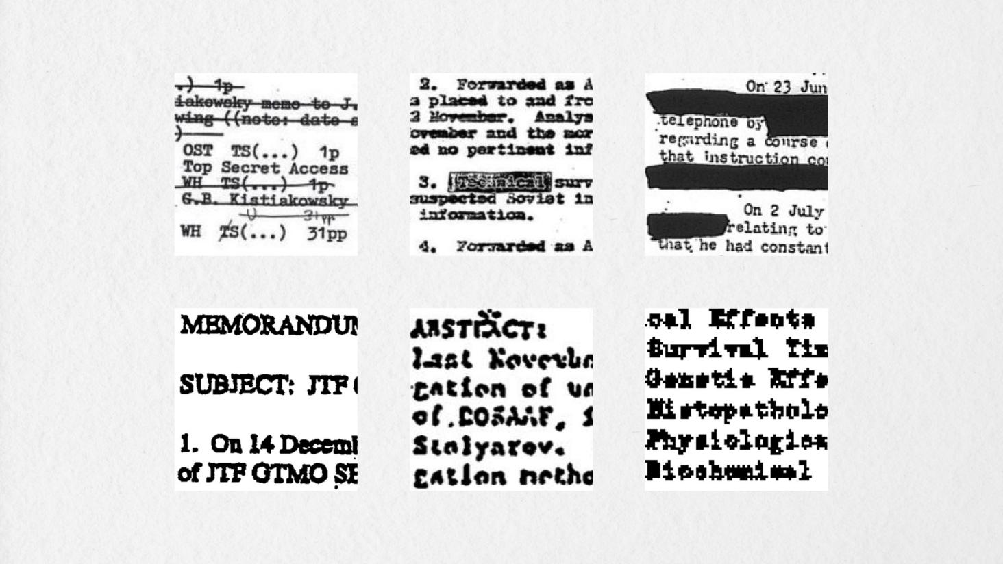
Redaction is a custom typeface commissioned for The Redaction exhibition at MoMA PS1 by Titus Kaphar and Reginald Dwayne Betts and drawn by Jeremy Mickel. It aims to address abuses in the criminal justice system, particularly the imprisonment of poor and marginalised individuals for failure to pay court fines and fees.
Whilst initial inspiration came from the functional yet familiar typefaces of the legal world, the team noted how text was degraded, (through copying and redaction), as documents moved through the legal process. They were keen to introduce this bitmapping effect, creating several variations which are become progressively more degraded.
By providing a range of grades from subtly analogue to nearly illegible, the typeface nods to the transformation and marginalisation that many people face in the criminal justice system today, and specifically, the role and responsibility of the author of the text to be conscious of legibility as a signature of power.
Find out more about the project and download Redaction here.
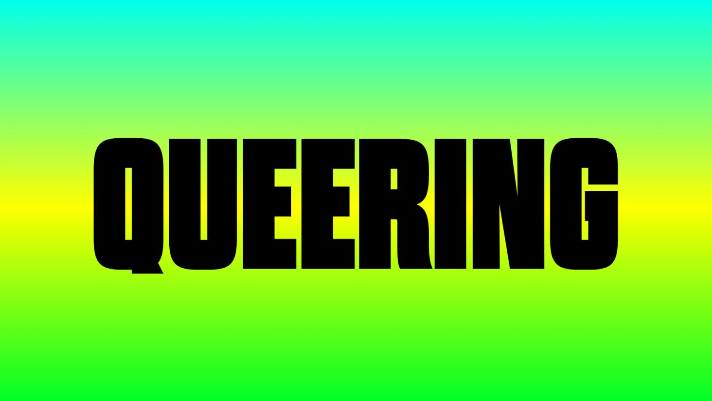
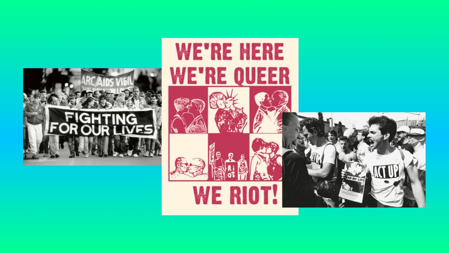
Queering
Designed by Freelance Senior Designer & Design Director, Adam Naccarato, Queering is a bold, condensed display typeface inspired by the typography of protest posters and queer publications, updated for the modern age.
Explaining the meaning behind the name, Adam explains:
“The name Queering comes from the activity of ‘Queering a Space’ — transgressing what are seen as fixed categories — such as gender and sexuality.”
Queering is pay-what-you-want and open source, covered under the SIL Open Font License with all profits benefiting the Ali Forney Center in New York.
Find out more about Queering and Adam’s work here.
Conclusion
In summary, typography is so much more than a visual detail. When used thoughtfully, it becomes a voice for change. For charities, that voice can shape how people connect with your mission, how they feel when they encounter your brand and how motivated they are to take action.
A purposeful approach to typography can do more than make a message look beautiful. It can make it meaningful. It can help your charity build recognition, strengthen trust and express values that words alone cannot convey. The right type choices can evoke empathy, urgency or hope, creating a deeper emotional bond between your organisation and its audiences.
When charities use typography intentionally, it has the power to start conversations, raise awareness and inspire lasting change. It can draw attention to critical causes, challenge perceptions and even become a symbol of a movement. At Studio Republic, we believe that every letter, word and headline can help amplify purpose. Typography, when used with care, becomes a tool for storytelling, advocacy and impact, helping charities communicate their message clearly and powerfully to the world.
If you have a brand project that you’d like to discuss with me, feel free to reach out to me on paul@studiorepublic.com