
Keeping UI design simple: why clarity creates better charity websites

Introduction
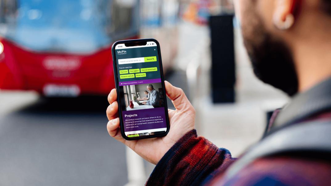
For charities, a website is far more than a digital presence. It is a platform for connection, storytelling and impact. Whether you are inspiring donations, sharing vital information or building trust with new audiences, your website needs to work for everyone who visits it.
That is where user interface (UI) design comes in.
UI design focuses on how people interact with your digital platforms. It shapes how intuitive, accessible and enjoyable those interactions feel. When it is done well, users can find what they need quickly and confidently, leaving them with a positive impression of your charity. When it is not, the experience can feel confusing, frustrating or overwhelming.
In this blog, we explore how simple, thoughtful UI design can help charities build websites that are clear, effective and inclusive, while supporting the goals of the organisation and the needs of the user.

Clarity in design
Simplicity is one of the most effective tools in creating a great user experience. For charities, this is especially important because audiences often visit your site with a purpose in mind. They may want to donate, learn about your services, or find help quickly. A clean, clear interface ensures they can do exactly that without distraction.
At Studio Republic, we prioritise simplicity in every project we deliver. Our design approach focuses on guiding users to the information that matters most, while avoiding unnecessary visual clutter or complex navigation.
Interactive elements such as accordion dropdowns or search filters are great examples of how to simplify without losing depth. They allow large amounts of content to be organised in a way that is easy to explore. Users can choose the sections that interest them, while everything else stays neatly tucked away.
Visual hierarchy also plays a vital role. By using imagery, spacing and typography intentionally, we help users process information more easily and stay engaged. For example, well-placed photographs or icons can break up long blocks of text, making the content more inviting to read and helping your charity tell its story more effectively.
Consistency in code
Behind every well-designed website is clean, consistent code. Consistency in coding is about creating reliable patterns and standards that make the site faster, more stable and easier to maintain.
When developers use familiar coding structures, they save time and reduce errors. For charities, that means a website that performs smoothly for every visitor and is easier to update as needs evolve.
A streamlined codebase improves loading speed and overall performance, both of which are essential for keeping users engaged. People are far more likely to stay on your site and complete key actions such as signing up, donating or getting involved if the experience feels effortless from start to finish.

Intuitive backend for admins
A charity’s website should not only be user-friendly for visitors but also for the teams managing it behind the scenes. That is why a well-designed content management system (CMS) is so important.
We know that charity teams are often small and time-poor, juggling multiple responsibilities. A complex or confusing backend system can make website management a frustrating task. That is why we design CMS structures that are simple, logical and clearly labelled.
We use consistent naming conventions, intuitive layouts and clear instructions so you can confidently update content without worrying about breaking the design. Simple prompts and short guidance notes help explain what each field does, reducing the learning curve and helping non-technical users feel at ease.
When your team can manage content quickly and efficiently, it frees up more time to focus on what really matters: delivering your mission.

Design restrictions that protect quality
Good UI design also relies on balance. Too much flexibility in the backend can lead to inconsistent layouts and cluttered pages. That is why we build systems with sensible guardrails to help preserve design integrity.
For example, we might apply character limits on headlines, set image dimension rules, or restrict how many items appear in a list. These design boundaries help maintain visual harmony and prevent content from overwhelming users.
Images are a great example. They are one of the most powerful storytelling tools for charities, but they can also slow a site down or distort the layout if they are not used correctly. By introducing features like automatic cropping and mobile-specific versions, we make sure that every image looks its best on every screen without affecting performance.
Navigation is another area where simplicity matters. Overly long menus or multiple dropdown levels can easily confuse users on mobile devices. We often use slide-out menus that display one level at a time with a clear back button. This keeps navigation straightforward and ensures visitors can move around the site with confidence.
By building these limits into the design, we protect the user experience while giving your team enough flexibility to keep content fresh and engaging.

Images can be a critical element of a website’s effectiveness, but they must be integrated carefully to avoid issues.
Content Management Systems work most effectively when measures are in place to limit the use of excessively large image sizes. As one of the heaviest elements loaded onto a user’s device, images significantly affect performance, and high performance is a crucial factor in sustaining user engagement.
The challenge lies in balancing quality and performance, a decision best left to the developer! Implementing restrictive cropping zones simplify the user’s interaction with visual elements by ensuring that an image’s focal point remains intact for aesthetic balance. This is particularly important because images come in various shapes and sizes, and if an image doesn’t align with the component’s canvas, the end result may be confusing and overwhelming.
In addition, overusing components can undermine simplicity, particularly with repeatable elements. Placing restrictions on such elements—for instance, limiting the number of items that can be displayed inside a repeatable list—helps prevent components from being overused and appearing monotonous.

Restrictions come in various forms, and they don’t always align with CMS features. On the front end, mobile users can easily feel overwhelmed by the amount of information displayed in a single component.
To address this, mobile users should typically be shown a reduced amount of content, given the limited space of the viewport. Icons are an excellent alternative for conveying information that may not fit on screen at once. When this isn’t feasible, it may be necessary to offer users a simpler mobile description, which can be made available as a variation within the CMS.
The same applies to images, which may sometimes shift to portrait orientation on mobile. Providing mobile-specific versions of images allows the client to offer alternative options when their original images don’t display well on smaller screens.
Next, one of the main causes of design overflow on mobile devices is the navigation. It’s quite common these days to see mobile menus implemented as dropdowns. But, menus that extend to three levels or more can still feel overwhelming, even with this design concept. An effective solution we’ve used at Studio Republic is a slide-out menu, which displays child navigation links in a new view, complete with a clearly visible back button.
This approach prevents an overload of links on the screen at once, and for a key feature like navigation, it’s essential in ensuring the user doesn’t become disoriented early on in their site journey.
Simplicity for developers too
Not only do clients benefit from using an intuitive backend system, but developers will also find it easier to identify consistent patterns in structure. CMS platforms like WordPress offer developers numerous valuable features, preventing them from having to rebuild everything from scratch.
For example, WordPress offers templating, enabling developers to apply the same field groups across multiple templates, rather than recreating them each time.
A simplistic UI approach is beneficial not only for the client when building the application, but also for the developer when assisting with CMS updates and addressing bugs. Integrating a system this way contributes to a simpler, more cohesive technical process. At Studio Republic, these are key principles we follow when developing the structure of our clients’ sites.

How simplicity enhances accessibility
Simplicity and accessibility go hand in hand. When a website follows clear, consistent structures, it becomes much easier to make it accessible for everyone, including people using assistive technologies.
Well-structured code allows screen readers and other tools to navigate a site effectively. Clear contrast, logical layouts and descriptive labels all contribute to a smoother experience for users with visual, cognitive or motor impairments.
For charities, accessibility is about more than compliance. It is about inclusion. A website that is accessible ensures everyone can engage with your cause, connect with your story and take action, no matter their ability.

Conclusion: the outcome of embracing simplicity
Simplicity in UI design is one of the most powerful ways to create a better digital experience for everyone who visits your charity’s website. It helps users focus on what truly matters, makes navigation effortless and builds trust through clarity and consistency.
Behind the scenes, it also makes life easier for your team and developers, helping to ensure your website remains sustainable, manageable and effective long after launch.
A simple design does not mean a basic one. It means every decision has a purpose and every element serves the user. When your digital experience is clear, inclusive and thoughtfully designed, it leaves a lasting impression that encourages people to engage with your cause again and again.
At Studio Republic, simplicity is not just a design choice. It is a principle that runs through everything we do, from code and design to content and collaboration. It is how we create websites that empower charities to do more good in the world.
Ready to simplify your digital design? Get in touch today.
Email us
or give us a call: 01962 659 123

