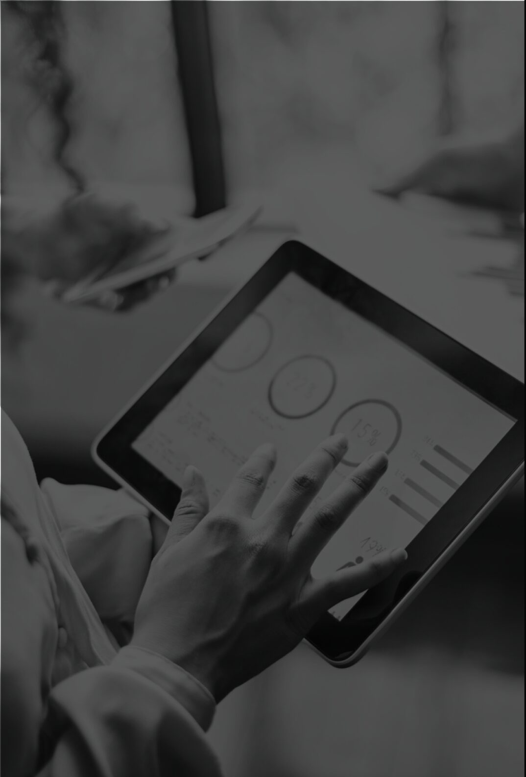
The power of inclusive design for online accessibility

What is accessibility?
In a nutshell, accessibility is the practice of making your website usable by as many people as possible. This is most commonly thought of as ensuring your website can be used by people with disabilities, but in reality it is much more than that. An accessible website is also much easier to use for those using mobile devices, an older demographic or those with slow internet connections to give some examples.
Accessibility is intrinsically linked to equality – treating all your visitors the same and giving them the same opportunities to get involved with your organisation, regardless of their ability or circumstances. It’s no different to excluding someone from your premises because they are in a wheelchair – it’s also not fair to exclude people from your website because they have a visual impairment.
Accessibility shouldn’t be regarded as an optional extra or a nice to have – it’s simply the right thing to do. It’s also protected by the Equality Act 2010 which requires service providers not to discriminate against people based on a number of protected characteristics which includes visual, motor, hearing, cognitive and learning disabilities.
What disabilities are we talking about?
In reality, there’s no such thing as “normal”. People with disabilities are just as diverse as those without disabilities, and so are their disabilities. We can however cover off the main types of disabilities to think about in the context of a website.
Visual impairments
This includes people with blindness, low vision and colour blindness. Many users will use screen magnifiers which can be physical devices, or the built in zoom facilities offered by modern operating systems. Others will use screen readers – software which reads web pages aloud. Much of this software is commercial, but there is free software available which I’d encourage you to have a go with on your own websites to experience what a blind visitor would hear when browsing your site.
285 million people are estimated to be visually impaired worldwide: 39 million are blind and 246 million have low vision
– Source World Health Organization
Hearing impairments
With the rise of video content, comes a challenge for those who are hard of hearing. Videos without captions are basically useless for these people so it’s vital to include captions on your video content and you should also consider providing video transcripts. It’s not just the hard of hearing who will benefit from this. Imagine a commuter visiting your website or social channels on the train. If they’re a considerate passenger or aren’t using headphones, your video content can’t be understood by them, so that compelling message you’re trying to get across is lost..
466 million people worldwide have disabling hearing loss
– Source World Health Organization
Mobility impairments
These people have difficulties with physical movement. This could be the loss of a limb or paralysis, or could be a neurological condition which leads to weakness or the loss of limb control. This also includes those with a temporary impairment – a broken arm or even something as simple as holding a baby in one arm while using a mobile device.
Many users will only use a keyboard for website navigation – because they can’t use a mouse or because their mouse is simply broken! Your website should be easy to use with a keyboard – try navigating your site without your mouse to test this out. On mobile, you should be able to navigate with one hand, so the navigation should be within your thumb’s reach, and all click targets (links and buttons) should be large enough to easily and accurately tap on.
Percent of adults with any physical functioning difficulty: 16.1%
– Source US Centers for Disease Control and Prevention
Cognitive impairments
This covers a wide range of disabilities including mental illnesses such as depression and schizophrenia as well as people with learning disabilities such as dyslexia and ADHD. There’s a lot of diversity in the challenges and needs of this audience, but it boils down to a common set of issues. The ability to understand content, remembering how to complete tasks and the confusion that can be caused by having inconsistencies in your website’s design and layout. When you add to this audience those who speak English as a second language, making sure your content is easy to understand becomes even more vital.

The tenets of accessibility
- Perceivable: All users should be able to accurately see and read your website content. That means content must not exclude people with vision loss, hearing loss and other disabilities.
- Operable: Website content should be responsive and simple to navigate for all users, for example, using keyboard only commands to navigate a website rather than a mouse.
- Understandable: Website interfaces and information should be organised in a way that makes them easy to use, predictable to navigate and contain language that is understandable to all users.
- Robust: Websites should be compatible with a wide range of technology, including assistive technology tools that are commonly used by users with disabilities.
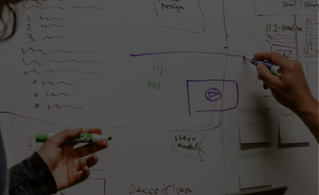
What can I do to be more accessible?
Obviously, the best place to start with accessibility is at the point a website is conceived. Planning out the User Experience and content with accessibility in mind is by far the easiest place to start. It’s a myth to say that this is an expensive added extra for a website. In reality, as an industry we can do much better. We produced a set of guidelines for agencies who want to do better. This includes a simple checklist designers and developers can use to embed accessibility into their everyday workflows. Taking this approach, it becomes second nature and is actually really easy to achieve. This document is available to download at the bottom of this article so you can read it for yourselves and pass it on to your agencies.
Retrofitting accessibility is undoubtedly more of a challenge but it’s never too late and it’s important to note that you don’t have to fix everything all at once. There are lots of things you can do to ensure that your content is accessible. Some changes will need either some technical knowledge, or will require the input of your developers so there may be some cost involved. But when you consider the amount of users who aren’t converting on your site because they can’t get through your donation funnel it’s a worthwhile investment.
Scroll down for a starter on some elements you can review and modify to make your website more accessible and inclusive to all your users.
Headings
Are you using headings (H tags) in a meaningful way? Each page should have an H1 tag which explains the purpose of the page, and a hierarchy of H2 to H6 tags to infer the importance of each section of content.
Images
Are the images on the page serving a purpose? If not, why are they there? Images take bandwidth, slowing down already slow connections, and also have a carbon impact, so only use them if they’re adding value. Alt tags are vital for screen readers and the alt text should be meaningful. An old practice was to stuff keywords into these for SEO, but this is really bad practice (and it doesn’t work any more!). Alt tags should describe an image in a meaningful way, serving the same purpose as the image would to someone without a visual impairment.
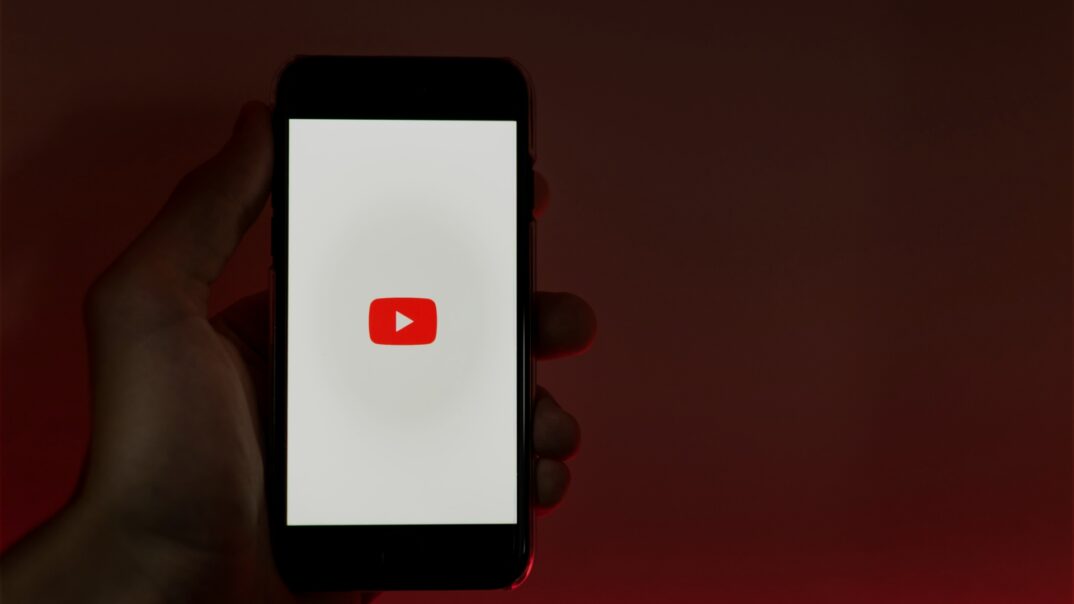
Videos
Please ensure that as a minimum your videos have captions. This is really easy to do with services such as YouTube and there are many companies who offer the transcription and captioning of videos for a surprisingly small fee – this can be as low as £1 per minute. Adding transcripts to videos on your site has the added benefit of having the text content there for search engines to index.
Links and Navigation
- Add meaning to your links. “Click here” is meaningless to a screen reader, but “Find out how to donate” makes much more sense for all users. Again, there’s SEO benefit here as it gives search engines more context for the link they are following.
- Keep your navigation as succinct and as uncluttered as possible. Make the titles easy to understand – this will benefit all your users.
Page layouts
Use consistency layouts throughout your website. This doesn’t mean that all pages have to look the same, but for example if you have social sharing links, make sure they’re always presented in the same way and in the same place on the page.
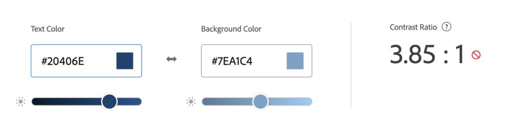
Colours
With 1 in 12 men and 1 in 200 women having colour blindness, ensuring that your content isn’t hard to read (or even invisible) due to your choice of colour combinations is an easy fix. Ensuring there is enough contrast between the background and text colours is also really important and is easy to test and rectify. Systems such as Adobe Color now include Accessibility Tools to test whether a contrast ratio is accessible or not (such as the example above).
Content
Ensuring your content is easy to read and is written using plain language is a must. Make sure you’re breaking up long content with meaningful headings to a user can easily scan the page and jump to the content that most applies to them. Consistent calls to action will help guide your users through the website. Also, make sure you’re adding calls to action within your content. Don’t add your ask to the bottom of a case study for example – your data will show that only a subset of users will make it to the bottom of the page.
Try to avoid distractions that will get in the way of your users carrying on their journey on the site. For example, when a user begins on their donation journey, consider taking off the navigation from that page, so their focus is entirely on making the donation. The last thing we want is for a potential donor to be distracted by reading a news post when they could be handing over their hard-earned cash!
Wherever you have a web form, consider it from a user’s perspective. What is the minimum amount of information we can ask them for? There may be more data we would like to capture, but with each field you add to a form, the conversion rate will drop. Make sure you label each field in a meaningful way, and if it’s information that may cause concern, explain why you are asking for it.
Available resources
- Take away what we’ve discussed today and learn the principles in more detail so you can then implement in your product.
- Test your own accessibility to find out to what extent your website complies with WCAG guidelines. There’s plenty of free WCAG compliance checkers such as this version here, or this online tool from Accessibe which will scan a web page and give you an in depth report of any accessibility issues.
- Try a free screen readers – screen reader software reads pages aloud for users with cognitive impairments. We recommend trying a screen reader and experience what a blind visitor would hear when browsing your site: NVDA (Windows), ChromeVox (Chrome), and Orca (Linux).
- Educate yourself on the laws and regulations around online accessibility. Although they’ll differ by country you can start by reading the website accessibility laws overview here.