Great design can transform your donation page from zero to hero
14th July 2017
You could say a donation page is an integral part of any charity website. Fundraising is a crucial objective for many non-profits and charity organisations. In order to help our community, there must be a steady flow of donations. Plus, with the digital generation we live in, online donations have become more dominant and popular. It's quicker, it's more effective and reliable. So, why not?
A donation page plays a bigger role than you might think.
First of all you need to guide your users to your donation page with clear and emotive calls to cation. Once they're on the page, you must continue to impress them by providing a clear, quick and rewarding experience.
Your donation page must have:
Great mobile experience
Mobile usage continues to grow so a donation page that you have to zoom in and out of on your iPhone is a no no. Remember, people are impatient and time poor. The faster the process, the more donations you will receive. In the 2012 election, the Obama campaign increased donations by 49% by optimising their processes.
Only the form fields you really need
Make it short, simple and sweet. By removing any form fields that aren't strictly necessary you make the process easier and quicker for your users. Additional fields required for GDPR compliance and in keeping with best practice guided by the Fundraising Regulator, can be hidden until the required point in the user journey.
Keep it simple
Reducing clutter from your donation form reduces confusion and gets your message across much more effectively.
Reassurance
This page (and the rest of your site) should load over a secure connection. It should be obvious that any credit card information will be handled safely. Your privacy notice should be clear and concise so your visitors can be confident that their information will be kept safe, and not shared with third parties.
Things to consider:
Branding and design
Strong branding and design shows confidence - this will help your users to feel confident with it. Details matter. Having an eye catching donate button throughout your website will help to drive traffic to the donation page.
Break it up
A multi-step form is a good way to increase giving. It breaks up the complicated donation process in simple steps. This creates a better user experience and increases conversions.
Make sure it works
Last but not least, remember to test, test and test your donate page before it goes live.
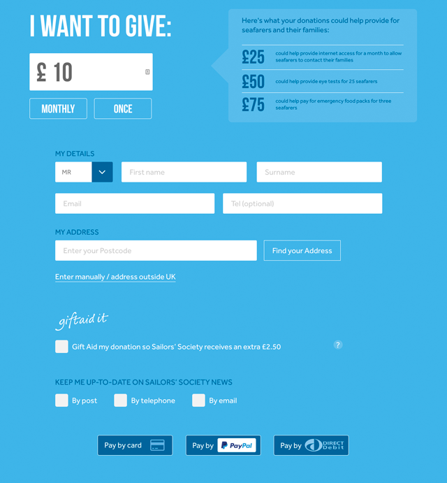
Our donation page for Sailors' Society:
The screenshot above is from the donation page we designed for our friends at Sailors' Society. We kept it simple, intuitive and responsive. Colours are vivid and eye-catching. Important information is in bold and clear and appears on the first page. On the thank you page we add some additional form fields to help qualify the user for future marketing. Keeping these out of the first step makes the initial form less daunting to complete and increases donations. We replaced the word 'Donate' to 'Give' with the intention of adding personality and empathy. The payment method takes as few steps as possible and offers a range of payment options - credit card, PayPal and direct debits provided by GoCardless. Giftaid is prominent, but by having the legal detail hidden initially, we reduce the clutter on the page. The full Giftaid information is shown when someone clicks on the question mark icon and when they opt in, keeping the page compliant.
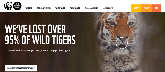
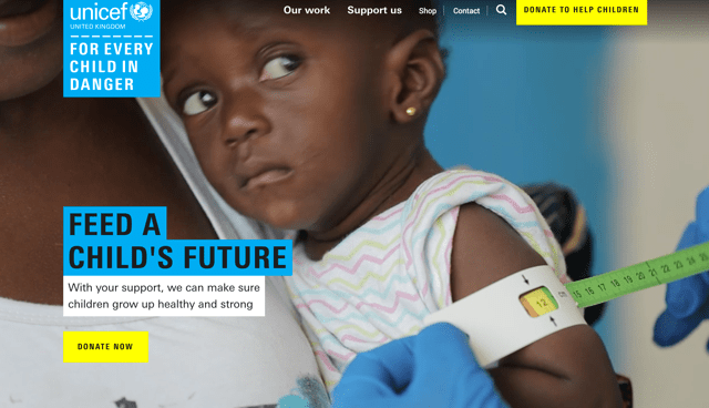
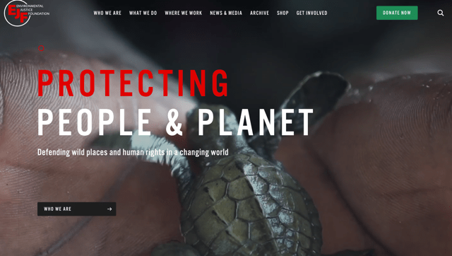
Here are some great donation pages that you might inspire you (and certainly inspired us).