
Introduction
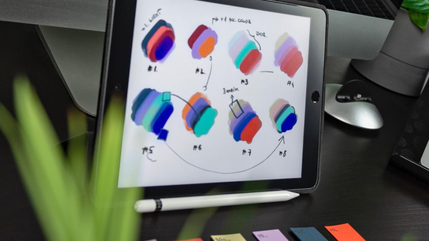
Colour plays a vital role in our work, with each one carefully considered and curated for maximum impact. Whether that’s applying colours to help people to differentiate information, improve content navigation or even elicit an emotional response from the user. However, recognising that users don’t perceive and interpret colours in the same way, means we can create and test designs that prioritise inclusivity.
This is what makes colour accessibility tools a critical part of our design process. They enable us to design effectively for individuals with various visual impairments – such as colour blindness or low vision – and help to identify potential issues and solutions.
Existing accessibility tools
At Studio Republic, we use several tools to check palettes and colour combinations, including whocanuse and Adobe Color’s colour contrast analyzer. Both are brilliant for quickly checking and adjusting the contrast of two colours. Whocanuse also has the added benefit of using query strings, allowing specific tests to be directly shared across teams or with clients.
However, there are limitations. In particular, both only allow for two colours to be checked at a time. This becomes very time-consuming as it means we often need to check multiple colours and all possible combinations of those colours. Should we need to make adjustments to a colour to improve the contrast ratio, we will then need to re-run all of the tests, further delaying the design flow.
The benefits of our tool
So, we’ve come up with a solution! Our tool aims to solve this issue while allowing the sharing each unique test’s URL. Based on a reliable colour contrast matrix, the tool enables users to add and compare multiple colours, either as Hex codes, RGB or HSL values. Each combination is tested and given a contrast ratio score, with icons indicating if it can be used for regular text and/or large text and graphic components.
The most powerful feature of the tool is the ability to adjust single problematic colours and have all contrast ratios updated in real time. This means entire palettes can be checked and tweaked within your browser. Lastly, we have included the option to choose your preferred WCAG level. Be it WCAG 2.1 AA or AAA or even the yet-to-be-implemented WCAG 3, this feature enables you to easily toggle between levels based on your desired grading.
Although colour is just one of the considerations when designing with accessibility in mind, it’s a crucial step in creating a more inclusive digital environment.
Give our free checker a try for yourself here and please do let us know what you think!
If you want to find out more about the world of accessible design, check out our free Principles of Inclusive Digital Design guide here.