Future-proofing a brand and user experience to advance progress in frontline Emergency Medicine.
The challenge
Royal College of Emergency Medicine (RCEM) wanted to improve site usability and their professional identity to encourage more medical professionals to join as members and better represent their impact within emergency medicine. We understood the importance of their work and given our experience in the healthcare field, we were keen to help them achieve this goal. Driven by user-led insights, we collaborated with RCEM to re-create and re-design a modern and credible user experience for new users and current members that could be easily managed by RCEM whilst they continued critical work on the frontline.
- Brand identity & application
- Bespoke web design & development
- Animation
The solution
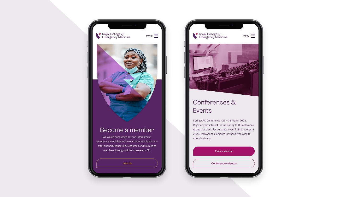
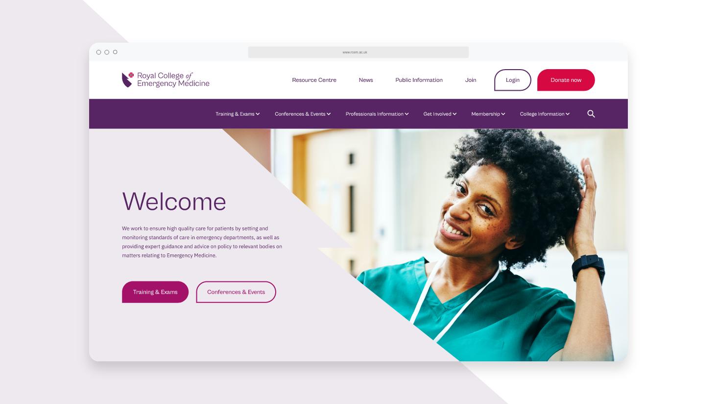
Our data analyst began by reviewing the site usability during scoping and shaped our overall delivery process to reach RCEM’s KPI’s. Analysing real user data early on also helped us to define and confirm that KPI’s set out aligned with the needs of audience groups. Our UX specialist then reviewed the existing website and related sites to gain an understanding of where they failed users across accessibility, navigation and overall UX. This combined analysis of the sites empowered us to present significantly evolved designs through an interactive prototype. At its heart was strategic navigation that directly overcame the evidenced challenges we unearthed.
Rather than building-out full pages that restricted the client’s ability to flex and grow the site in the future, we developed a versatile suite of modules to break up information across pages. This, in turn, has made it easier for users to digest and navigate through content on the site.

Creative & delivery
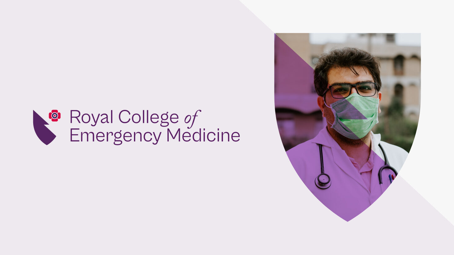
The existing brand had a notable history and legacy. Our main challenges were therefore to elevate what was great about the brand, whilst creating a much more usable, considered and contemporary identity. The shield itself was redrawn using the Fibonacci sequence to ensure visual balance and a well-structured composition. By removing the right half of the shield, we were able to give more prominence to the poppy and negate the need for a stroke and the potential legibility issues this was causing. The wordmark was also redrawn to provide more flexibility and personality, whilst striking a balance between RCEM’s history and future.
We built a restrained yet flexible colour palette around the royal purple synonymous with RCEM, whilst increasing its saturation to achieve a richer tone. To give the palette a sense of propriety, and inspired by the meaning behind the use of the poppy, supporting colours were named after plants used for medicinal purposes. We also created a colour usage guide to ensure that all combinations met WCAG accessibility ratings.